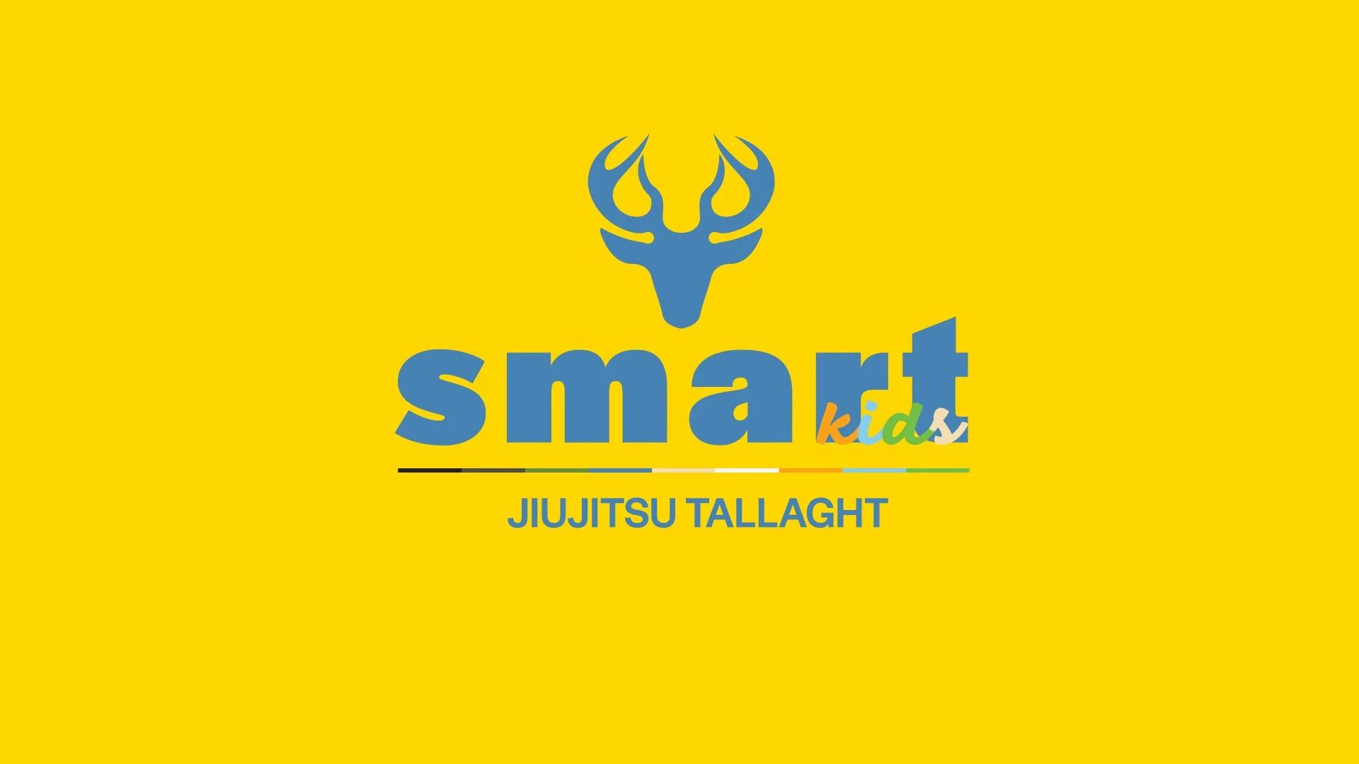
Smart Jiujitsu Branding
In alignment with the briefing, which emphasises creating an innovative and impactful brand, I chose Jiu-Jitsu as the focal point for the project due to its unique combination of physical, mental, and social benefits. Here’s why Jiu-Jitsu stands out as a meaningful.
“Jiu-Jitsu is for the small, for the weak, so they can defend themselves against the strong and powerful.”
Hélio Gracie
BRAND MISSION
Empower underprivileged children in Tallaght through Jiu-Jitsu, fostering discipline, confidence, and community.

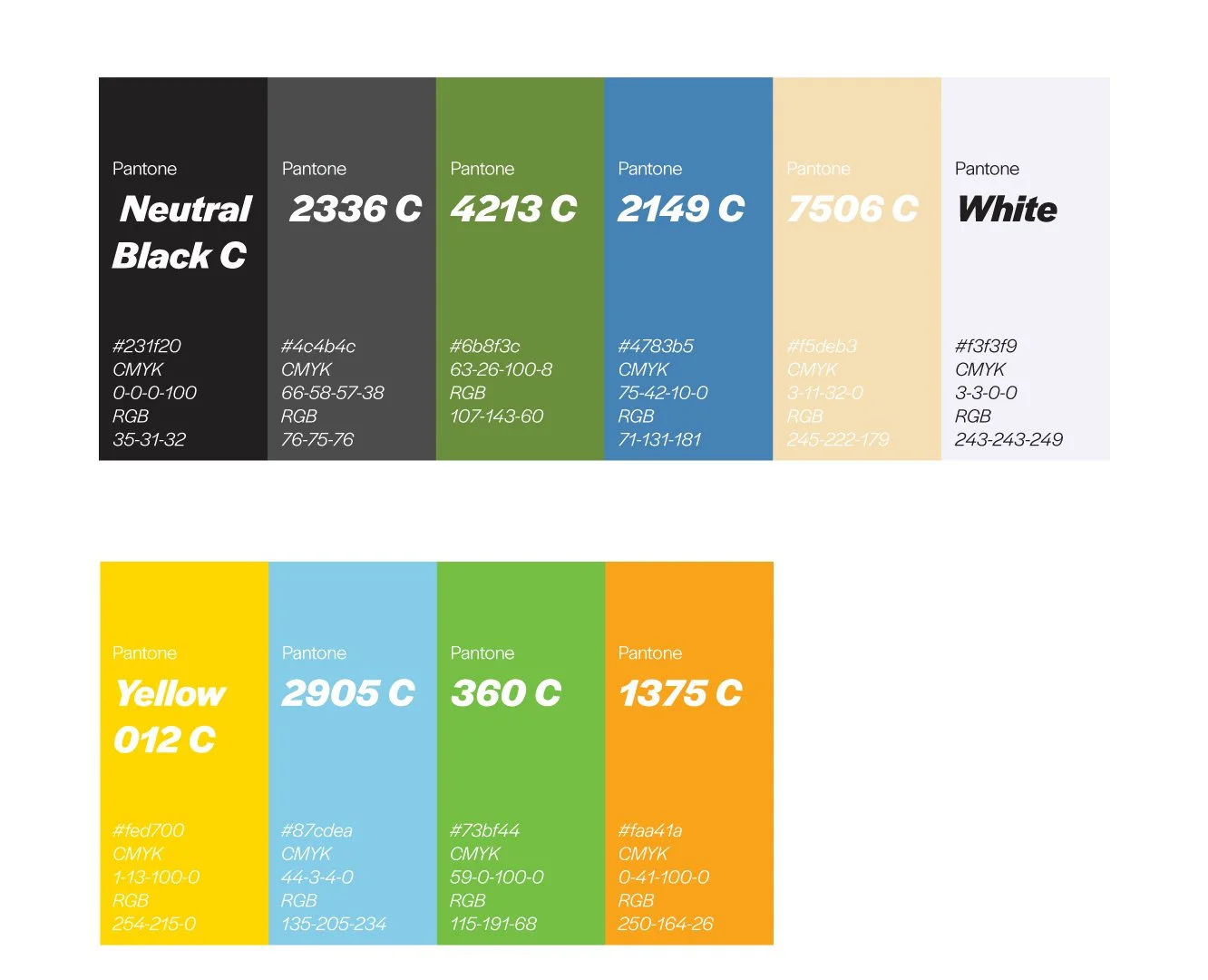
Colour Palette
The colour palette is divided into two categories: the primary colours, representing the main brand, and the children’s colours, which include an additional four vibrant shades designed to appeal to younger audiences. This distinction ensures a cohesive yet playful identity that aligns with the brand’s inclusive and community-focused mission.


Meeting the needs of the Tallaght community
BRAND VISION
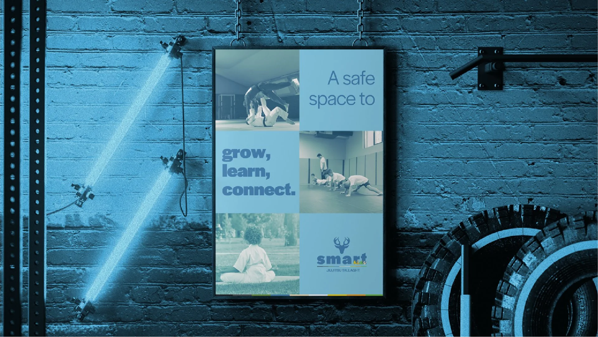
Create a safe space where every child has the opportunity to grow physically, mentally, and emotionally.
Kindness
Inclusion

Font
The colour palette is divided into two categories: the primary colours, representing the main brand, and the children’s colours, which include an additional four vibrant shades designed to appeal to younger audiences. This distinction ensures a cohesive yet playful identity that aligns with the brand’s inclusive and community-focused mission.
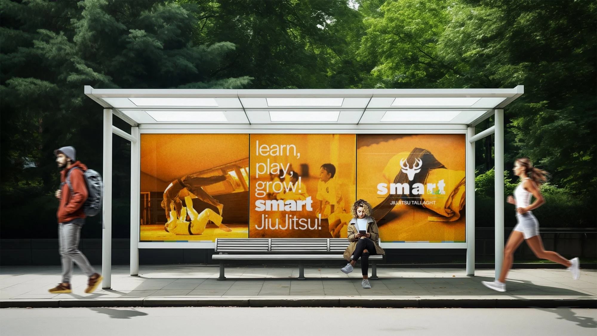
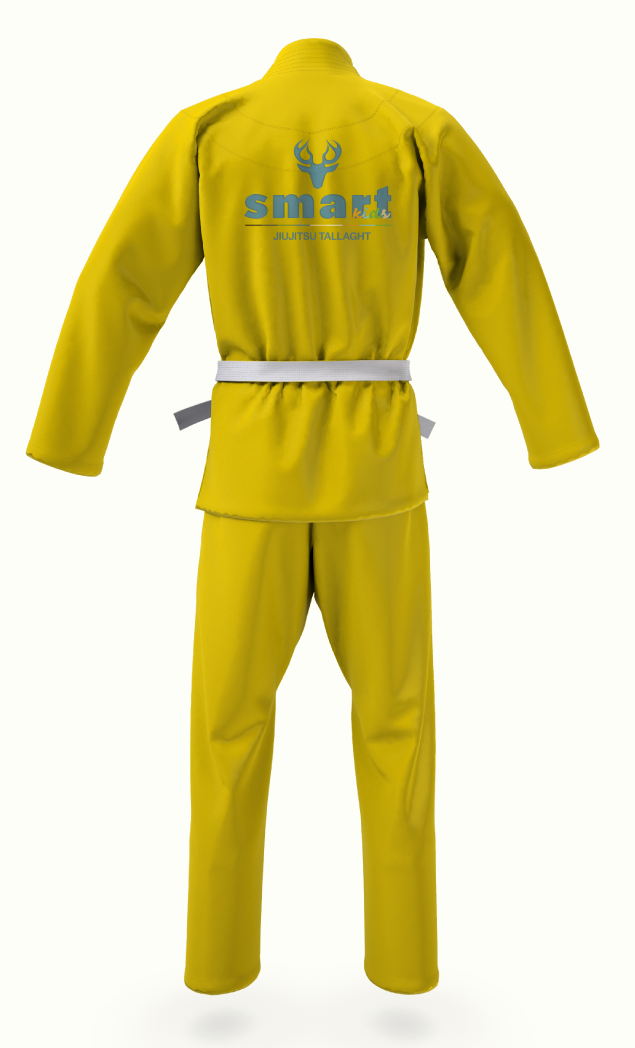
Mockup
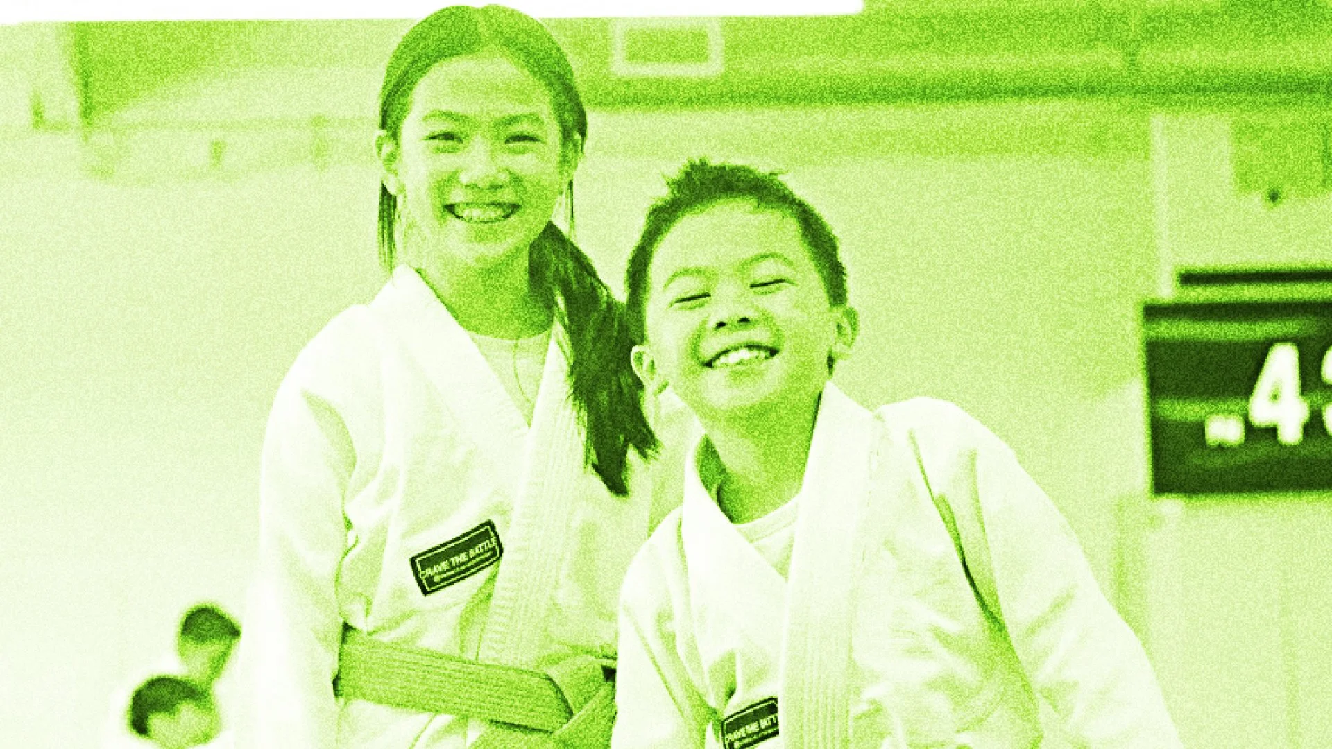
Jiu-Jitsu offers a structured and engaging activity for children in underserved areas like Tallaght, where there is often a lack of positive extracurricular opportunities. By introducing this martial art, the project provides a safe environment for personal growth, helping to reduce risks of delinquency while fostering discipline and respect.
CORE VALUES
Discipline
Resilience


Thanks