


Cashasa: The True Brazilian Spirit
This project explores the creation of a unique Brazilian cachaça brand, designed specifically for the Irish market. The goal was to position cachaça as a premium spirit, one that honours its cultural roots and artisanal production process while feeling authentic and accessible to a new audience. The brand name, Cashasa, was chosen to preserve the identity of the drink while making it easy for Irish consumers to pronounce and remember.
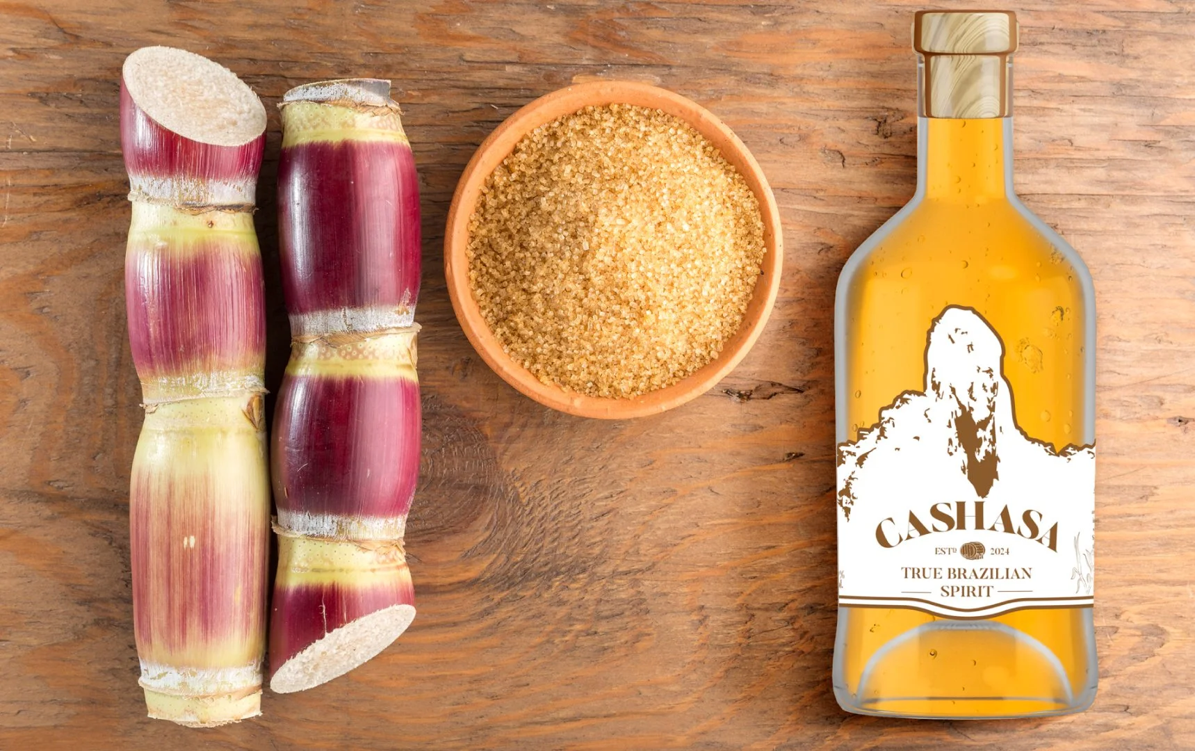
First Steps
The first task was naming the brand. After testing several directions, one idea stood out: naming the brand after the product itself. The word cachaça is spelled in a way that is genuinely difficult for a native English speaker to pronounce correctly. The solution was to swap the "ch" for "sh", Cashasa, a small phonetic shift that makes the name instantly readable and pronounceable for an Irish audience, without losing its Brazilian soul.
With the name settled, the next step was building the logo, a process that demanded more care and iteration, since the intention from the start was to create a brand with organic, handcrafted characteristics rather than a purely commercial, mass-market look.
Logo
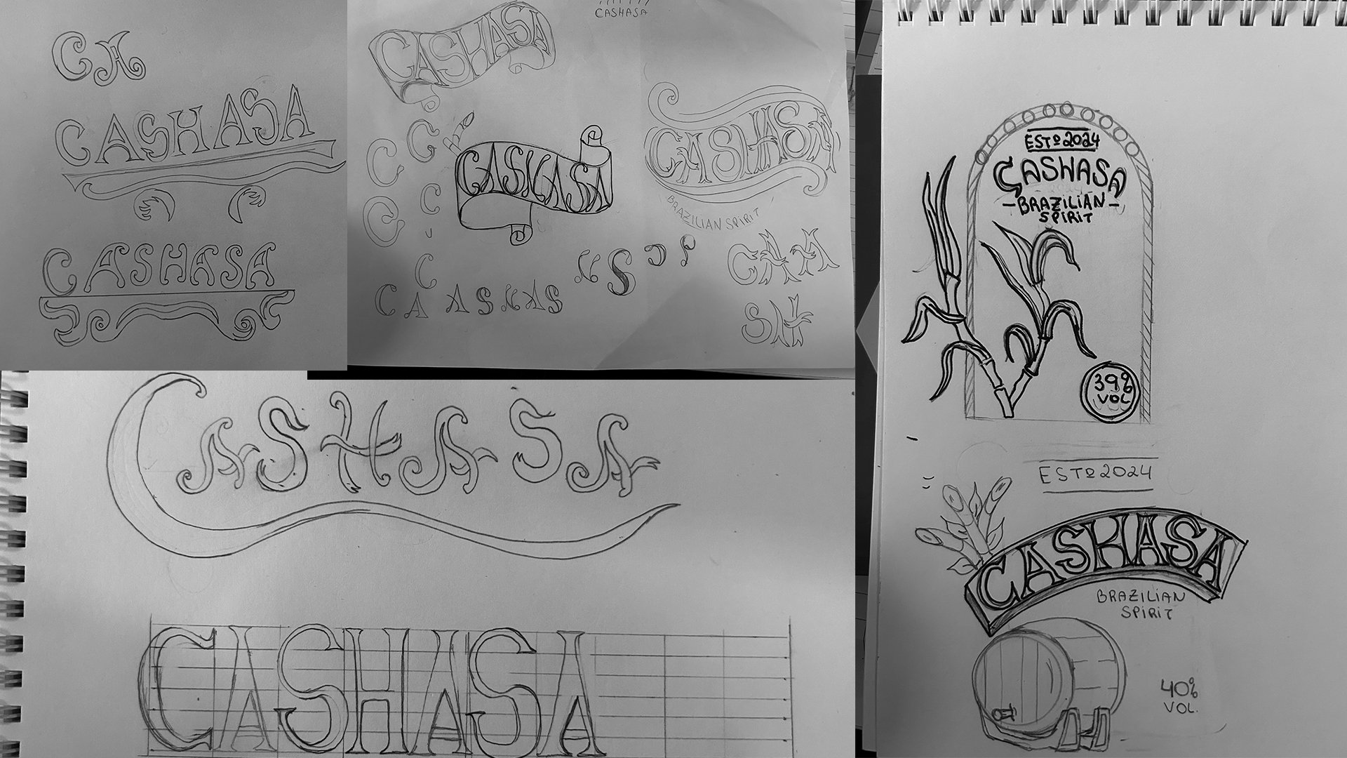
The first sketches explored different directions for what would eventually become the Cashasa logo, testing lettering styles, proportions and compositions by hand before moving to digital refinement.
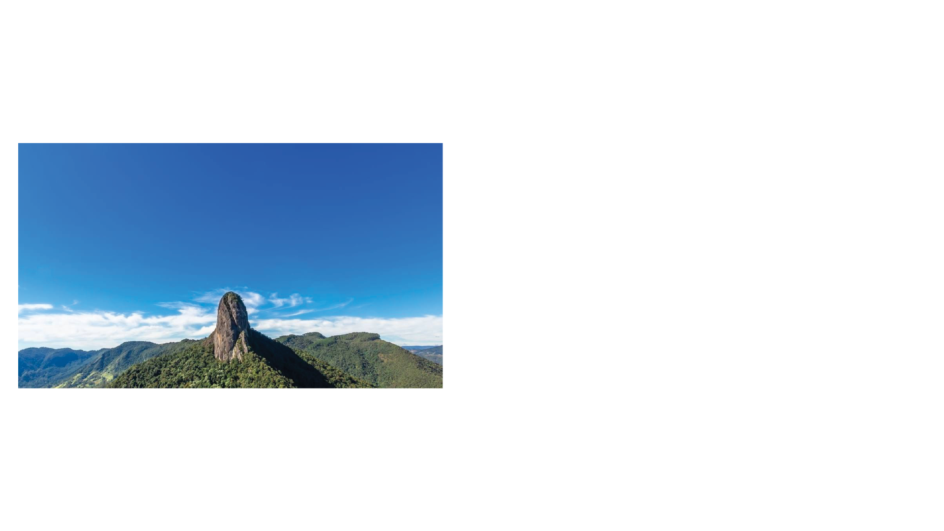
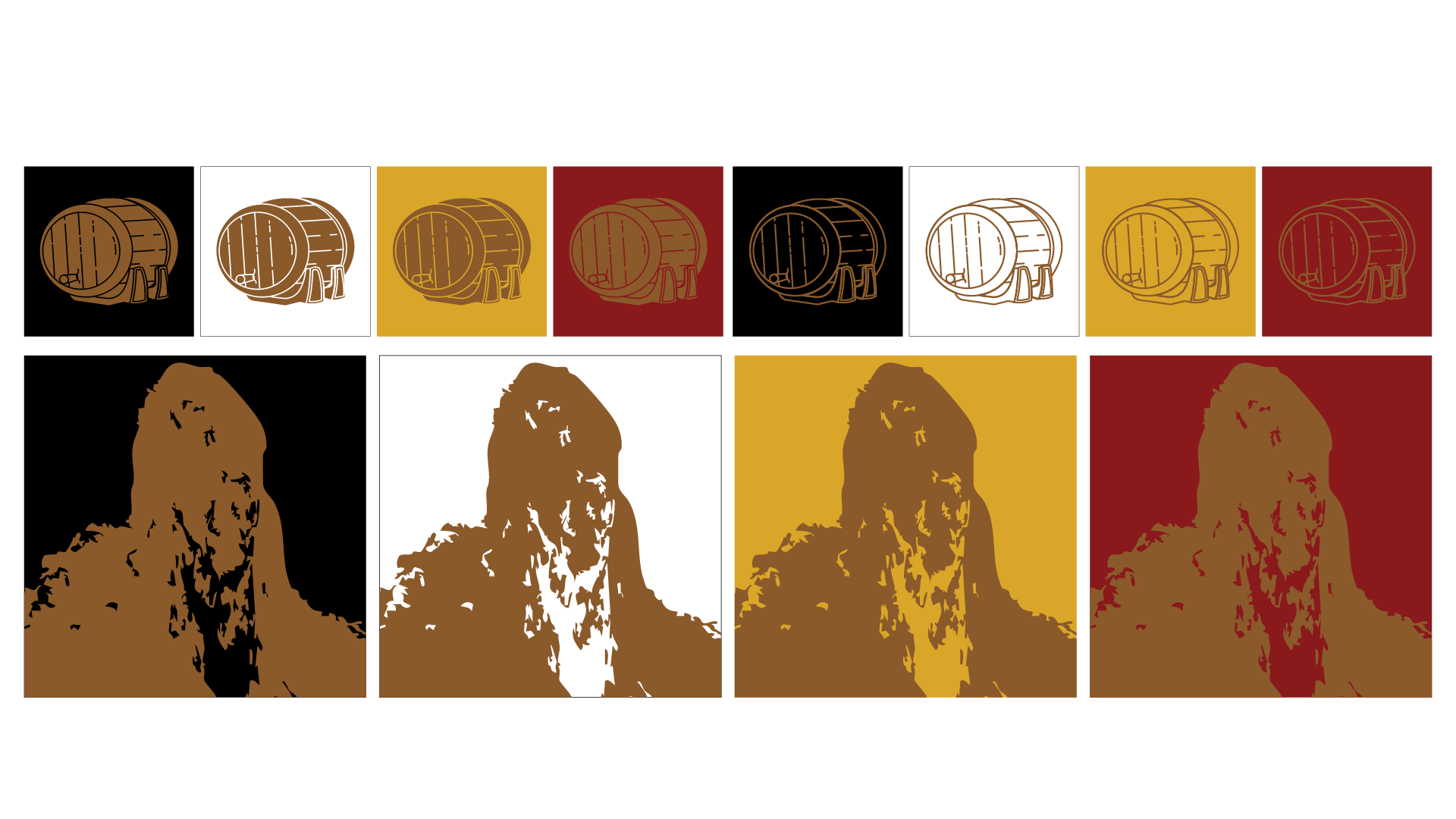
After the initial drafts, it became clear the layout needed an element that spoke more directly to Brazilian culture. That's when Pedra do Baú ("Chest Stone"), a landmark in São Paulo, became the centrepiece of the identity. Standing at almost 2,000 metres, it's one of the most striking and iconic natural formations in the state, a fitting tribute to include as the silhouette anchoring the Cashasa mark.
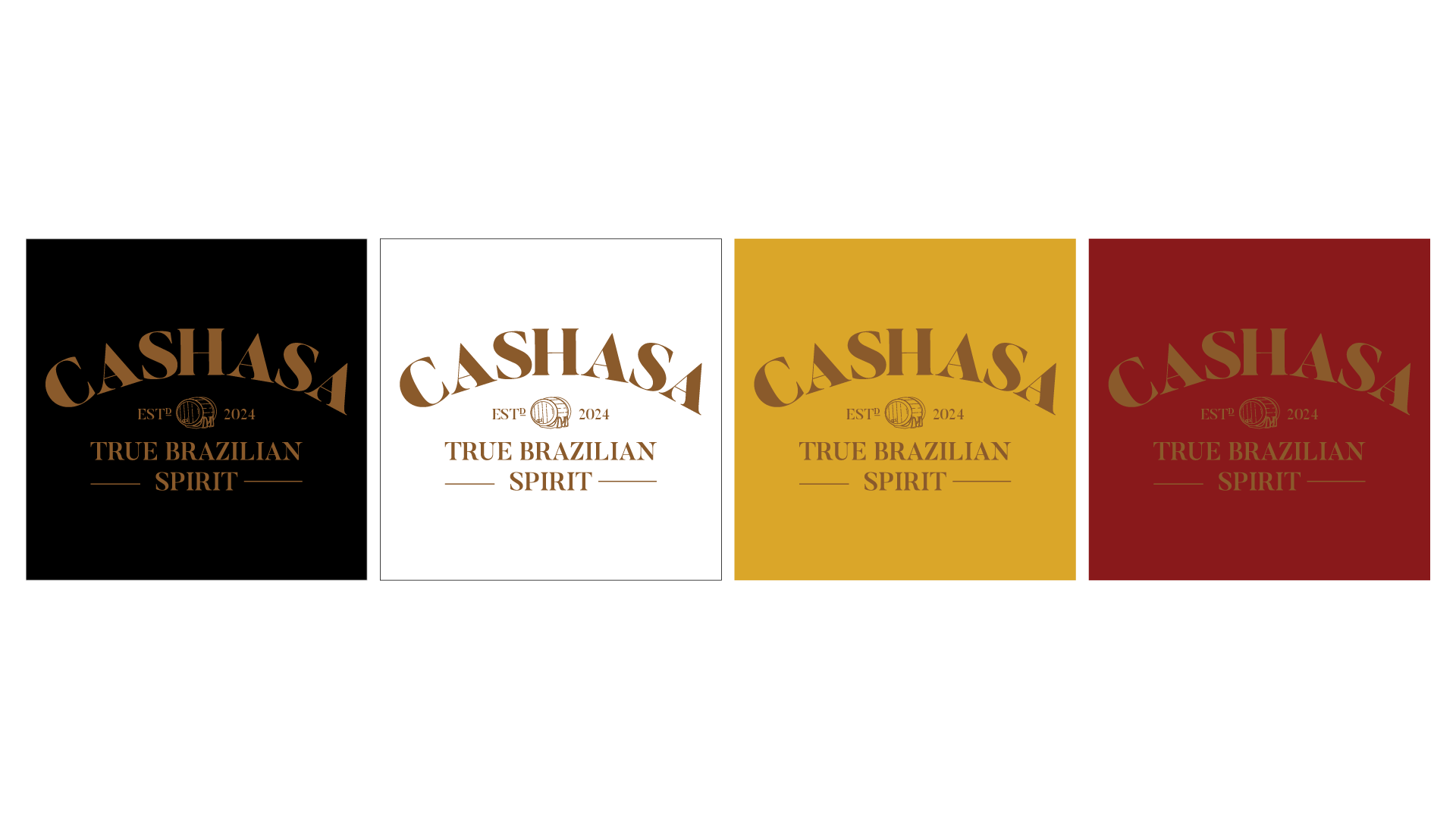
Final logo and Icons
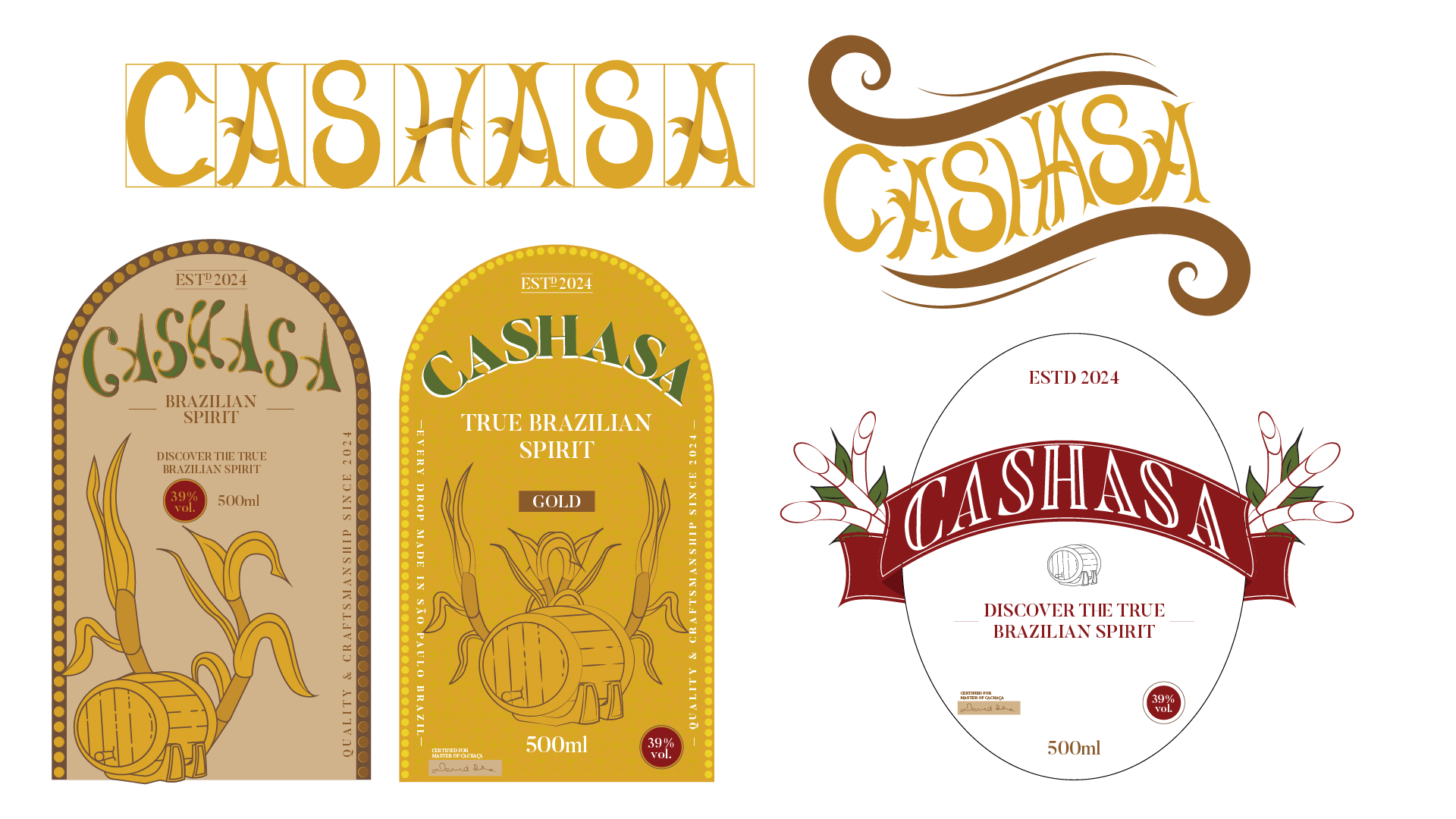
The final logotype was designed to balance elegance and modernity with the brand's organic roots. A barrel element separates the logotype from the call to action, guiding the eye and reinforcing the message: this is a spirit that has been aged, crafted, and matured with intention.
Label
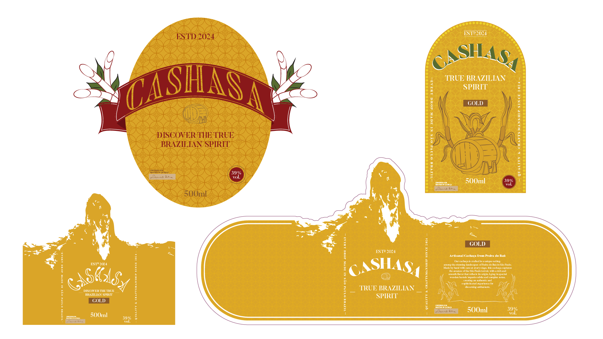
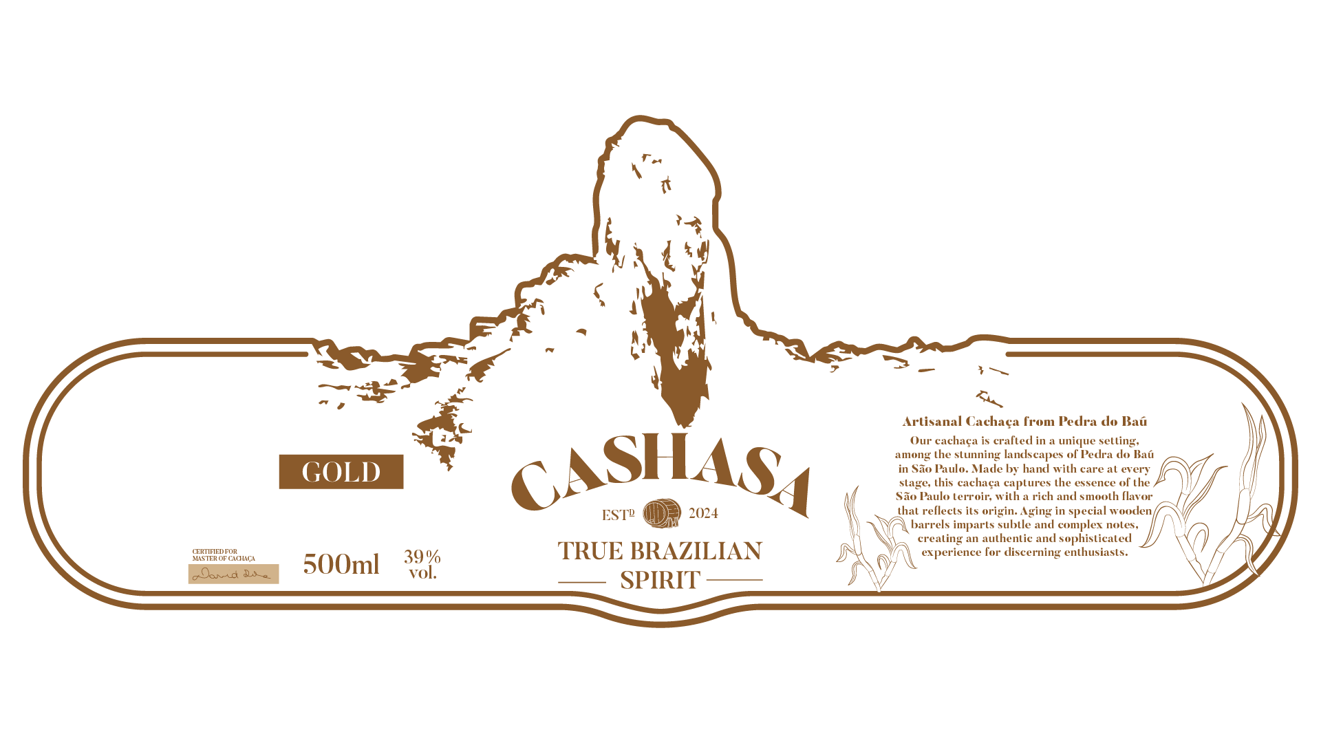
Several layouts and concepts were explored for the Cashasa label, from windowed formats to fully circular compositions. Some versions were strong on their own, but didn't quite express what the brand needed. A custom typeface was even developed at one point; however, pairing an organic typeface with an already organic layout diluted the premium, elegant positioning the brand was aiming for.
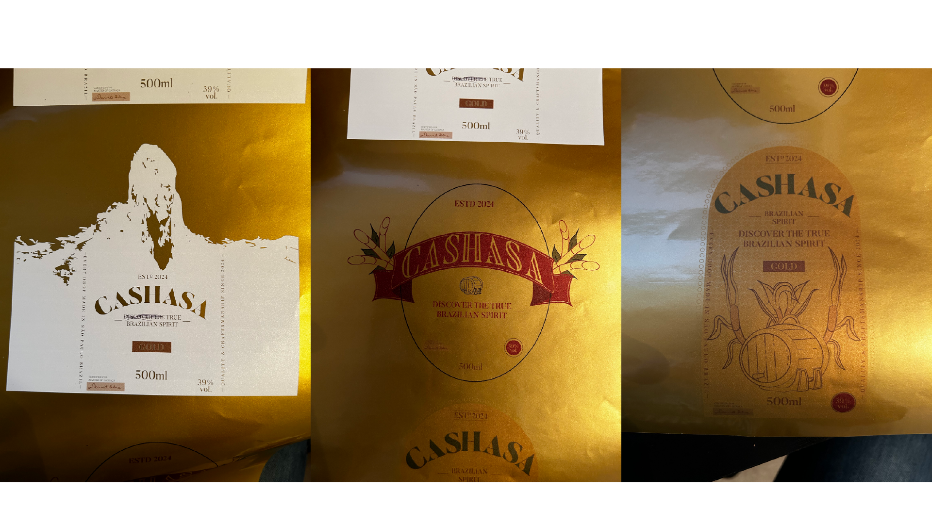
While some of these early tests produced great results once printed, the labels ultimately felt too heavy and visually dense, working against the high-end feel the brand was meant to convey, which led to a simpler, more refined final direction.
Package
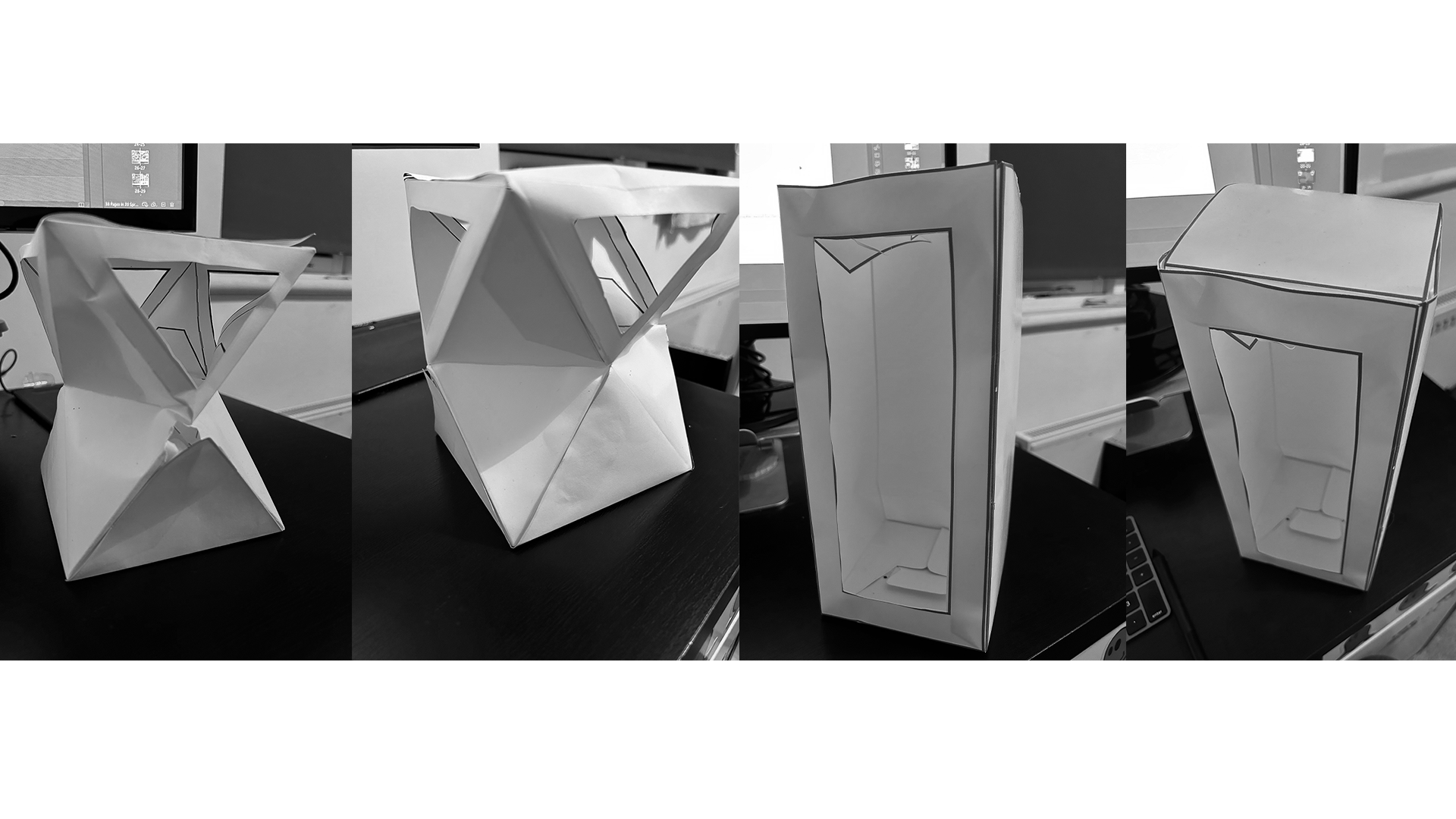
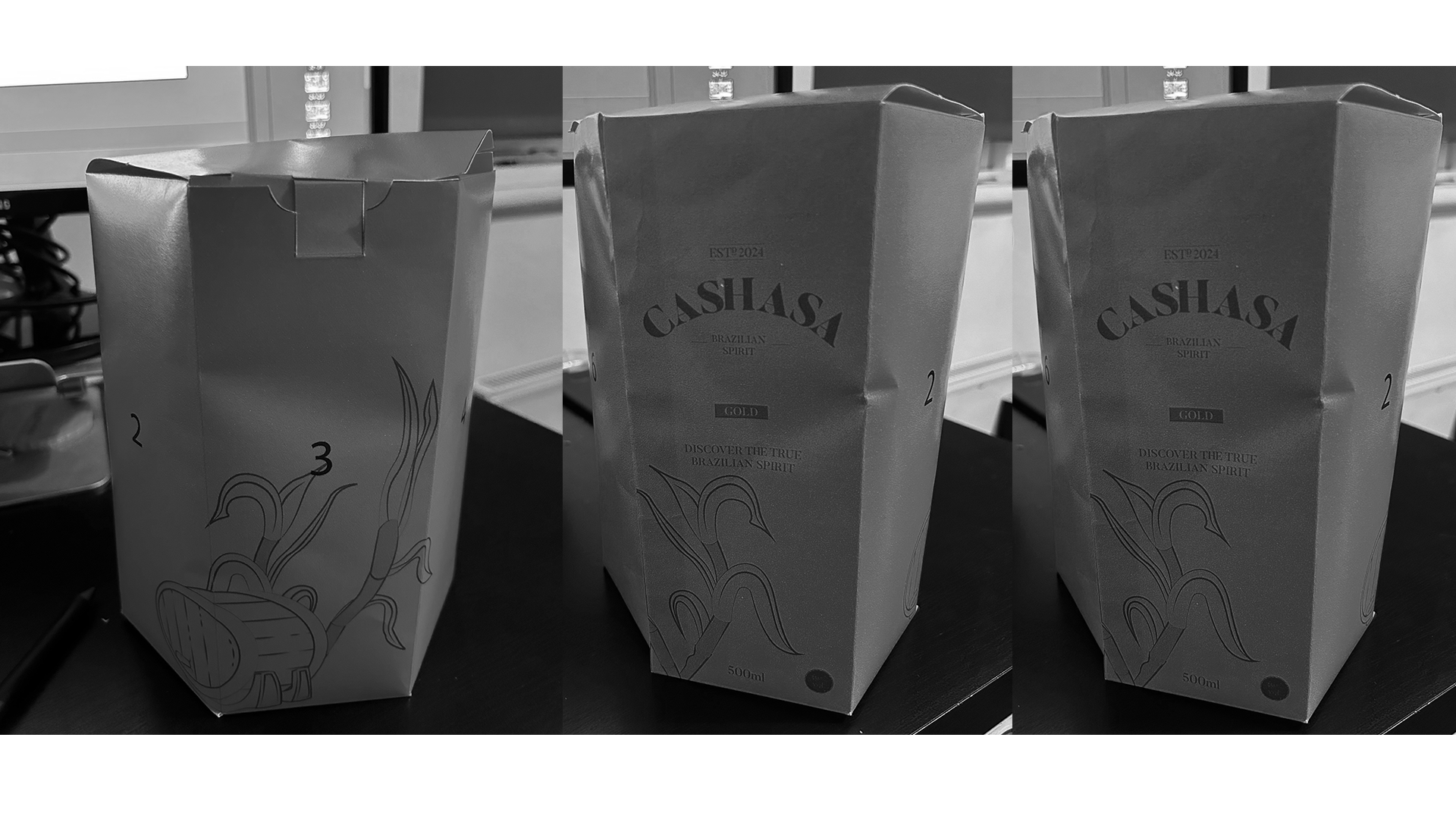
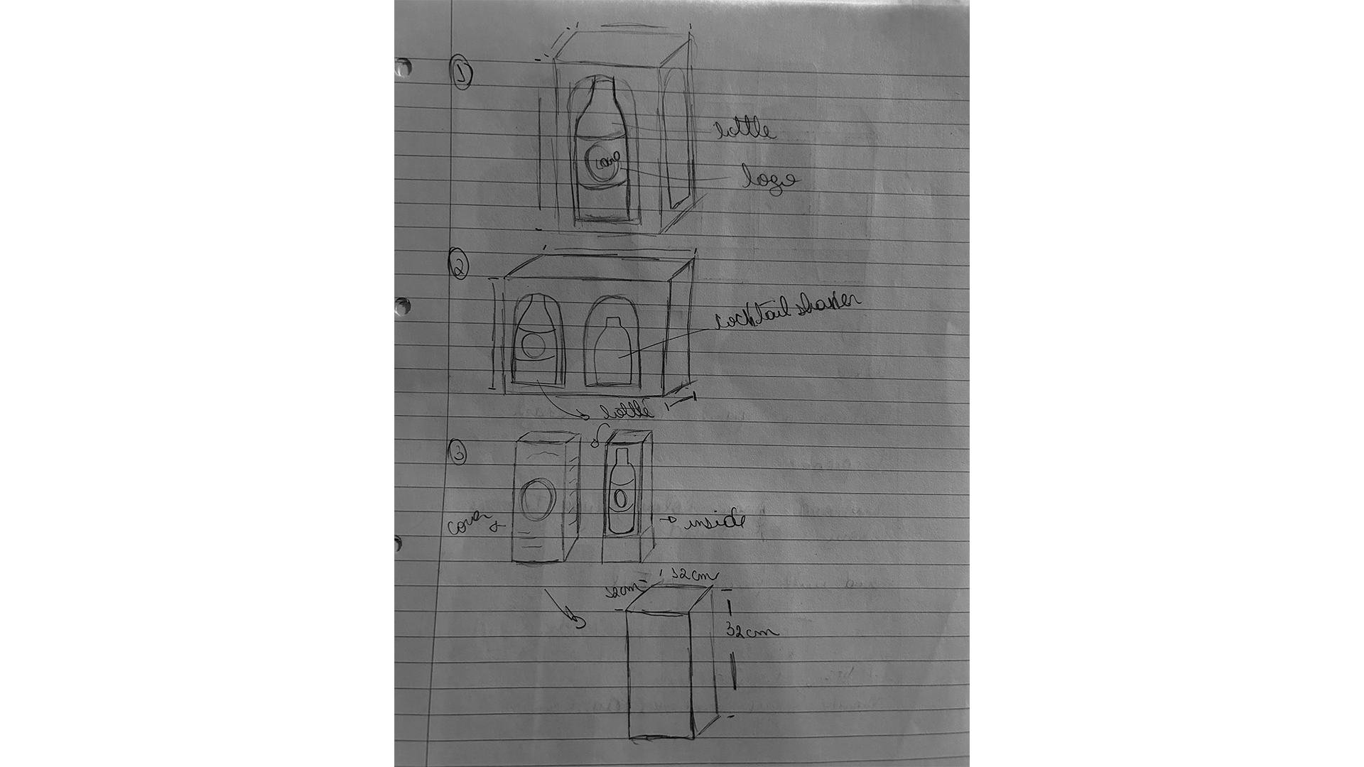
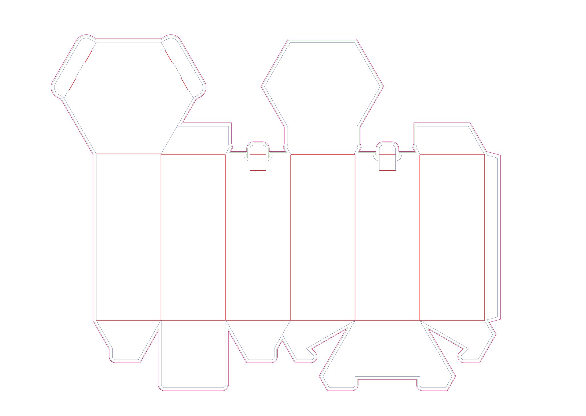
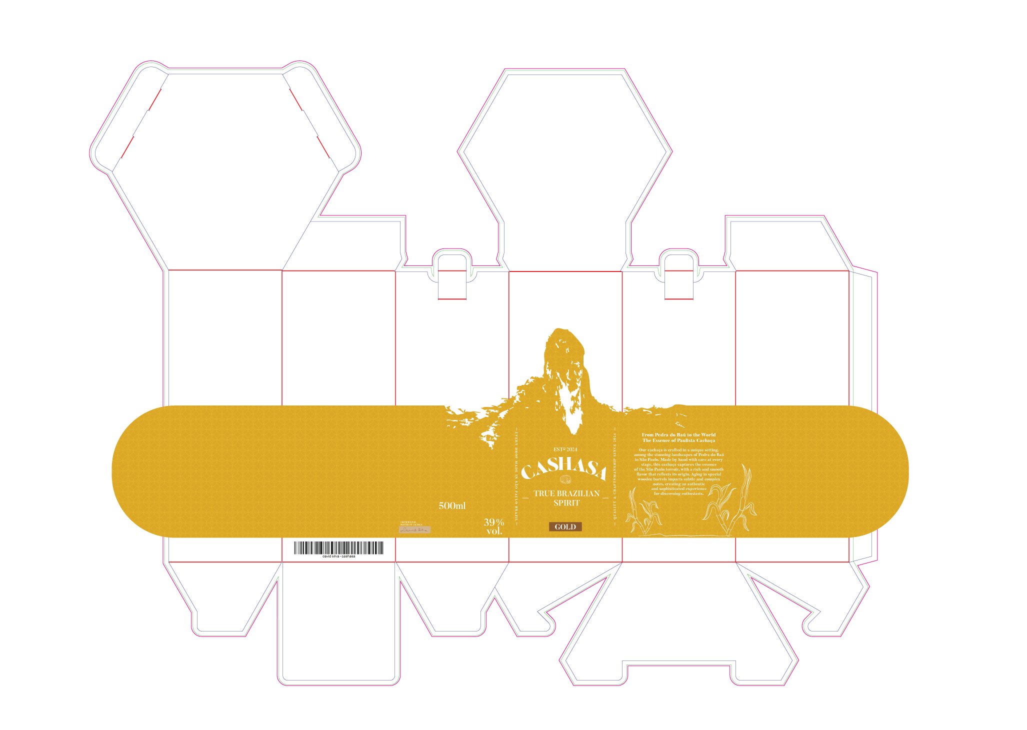
The initial concept was a conventional box, similar to a standard wine packaging format. As the project evolved and the target audience was refined, the direction shifted toward a more elevated, sculptural package, one that felt considered and premium rather than generic.
The final structural guide below shows how the packaging was engineered for print and assembly.
The colour palette was drawn directly from the stages of sugar cane, the raw material behind cachaça, following its transformation from field to barrel. The result is a palette that is not only conceptually grounded in the product's origin, but also elegant and versatile across packaging, label and campaign applications.
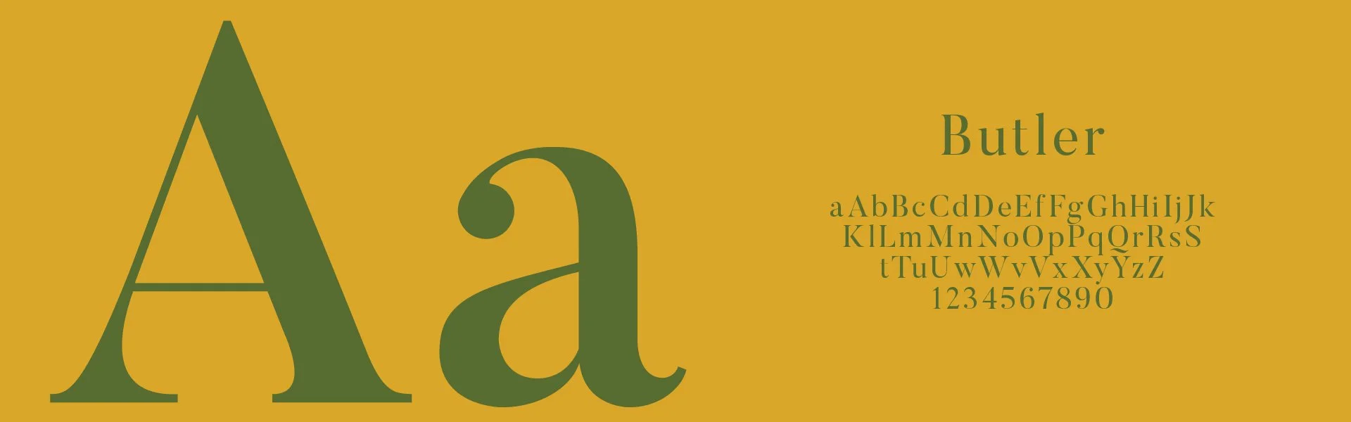
The chosen typeface is Butler, a modern and elegant serif that brings a sense of craft and sophistication to the brand, reinforcing the premium positioning without sacrificing warmth.
Black
#000000
Colour
Old Copper
#715038
Brand Push
#c38f2d
Fire Bush
#d9a629
Typography
Camo Green
#576c31
Old Brick
#8b191b
White
#FFFFFF

Mockup
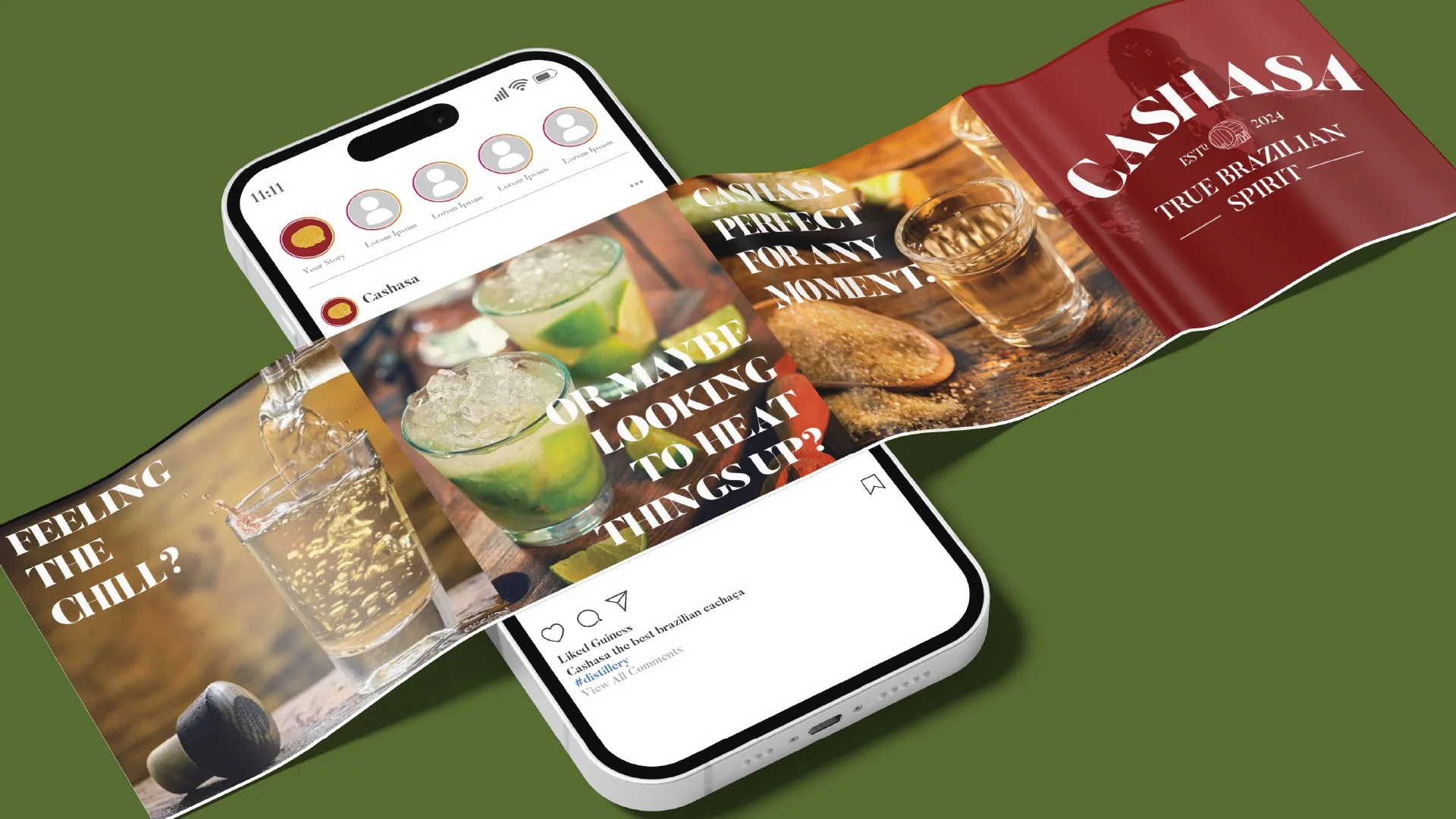
The project covers every stage of the branding process, from understanding the target audience to developing packaging inspired by both traditional Brazilian cachaça and international premium spirits trends. The final result combines the authenticity of Brazilian craftsmanship with the expectations of a modern, discerning audience.
Throughout the work, the cultural and sensory experience of cachaça is brought to life, aiming to connect with a market that values quality, uniqueness and new taste experiences.



Thanks
Final Project
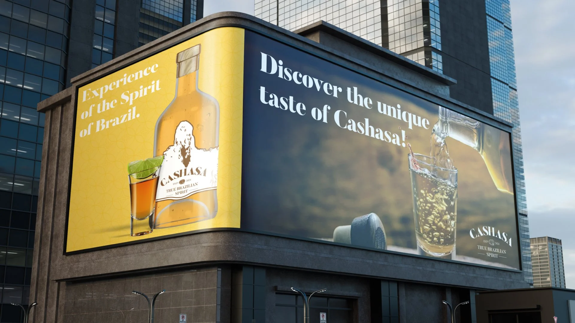
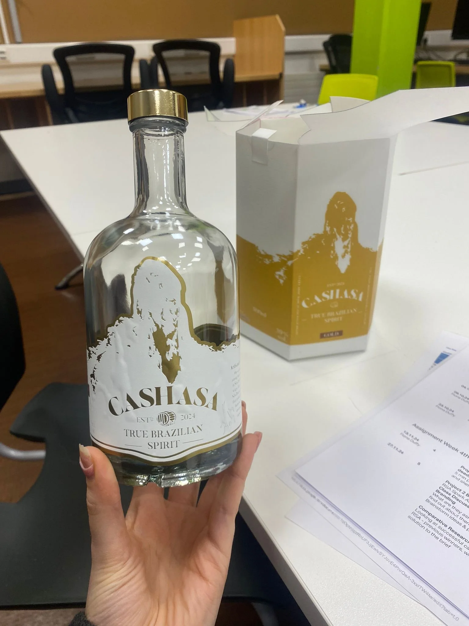
The image below shows the final mockup of the Cashasa project, bringing together logo, label, packaging and campaign into a single, cohesive brand experience.