Zaira visual identity manual & brand guidelines
Zaira was born from the meeting of two vibrant cultures with a passion for gastronomy: the rich and aromatic tradition of Lebanese cuisine combined with the tropical and welcoming energy of Brazil. This fusion is reflected not only in the flavor of the dishes, but also in the brand's visual identity, which balances sophistication, warmth, and authenticity.
Our goal is to create a visual experience that connects tradition and innovation, bringing together the elegance of Lebanese standards and the vibrancy of Brazilian colours, resulting in a unique and memorable identity.
Welcome to Zaira!
Logo
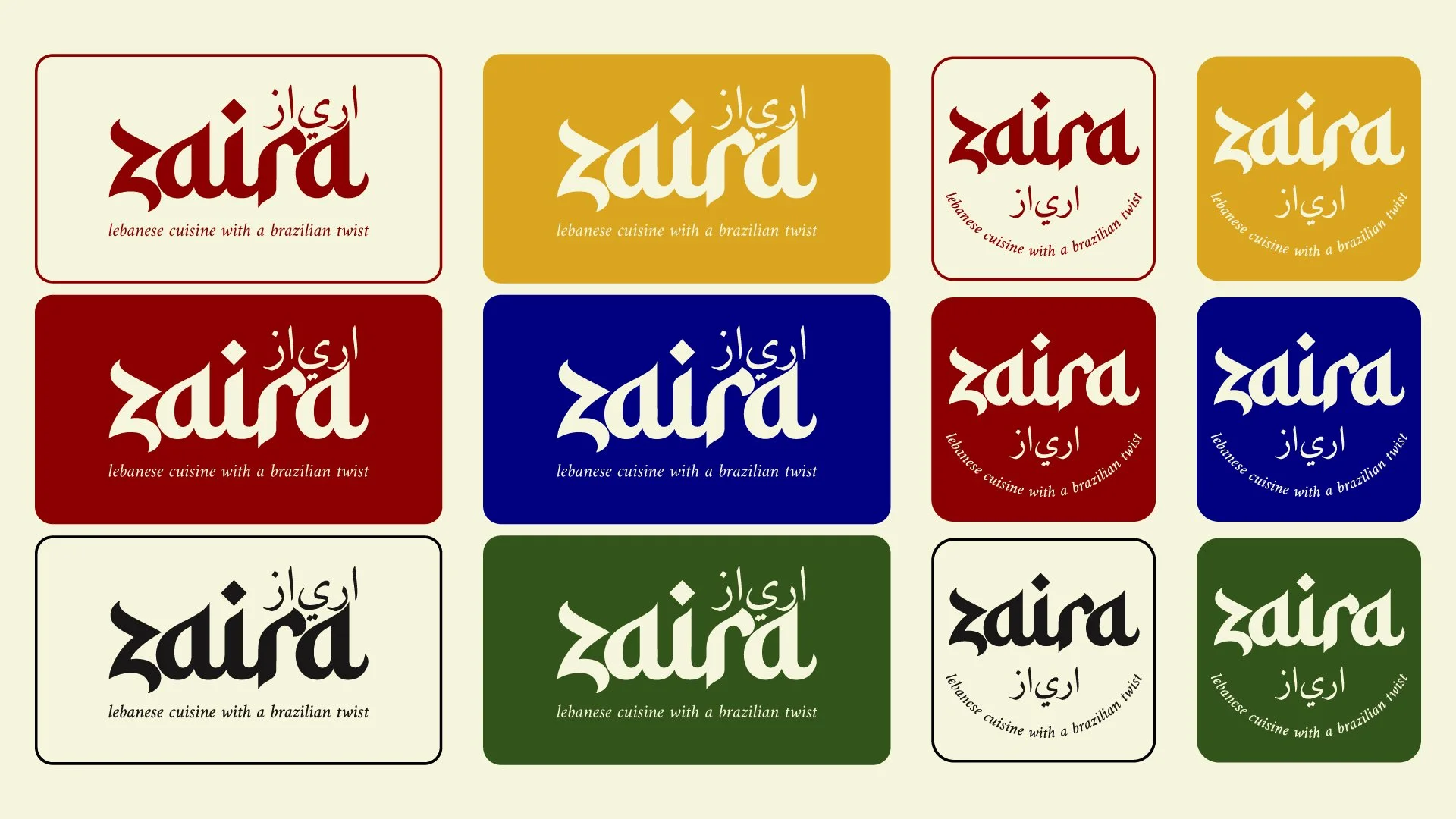
Logo colours were divided into two categories: Primary and Secondary.
Primary: These are the colours of the institutional brand and will be used in all visual communication.
Secondary: These colours will be used to create new products, promote promotions, and celebrate important dates. Therefore, they must be used with caution.
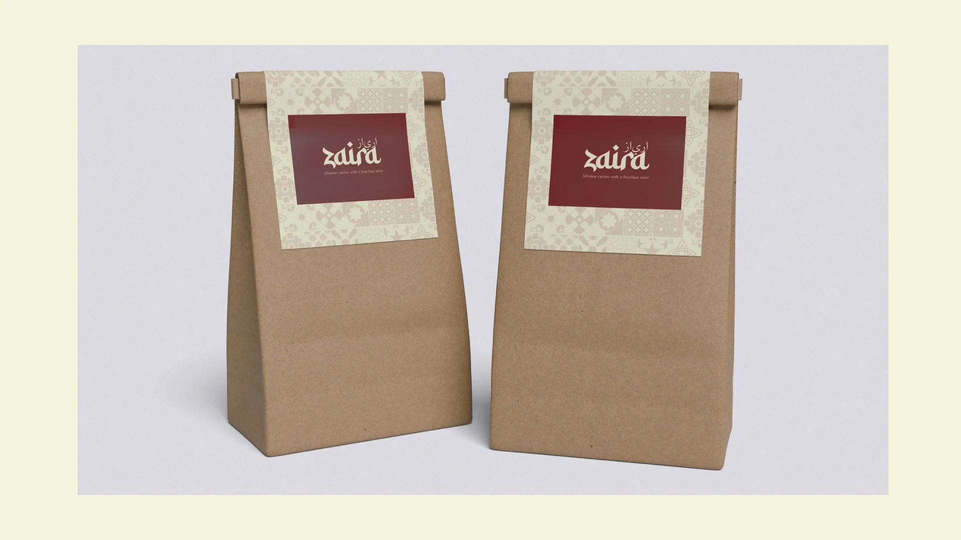
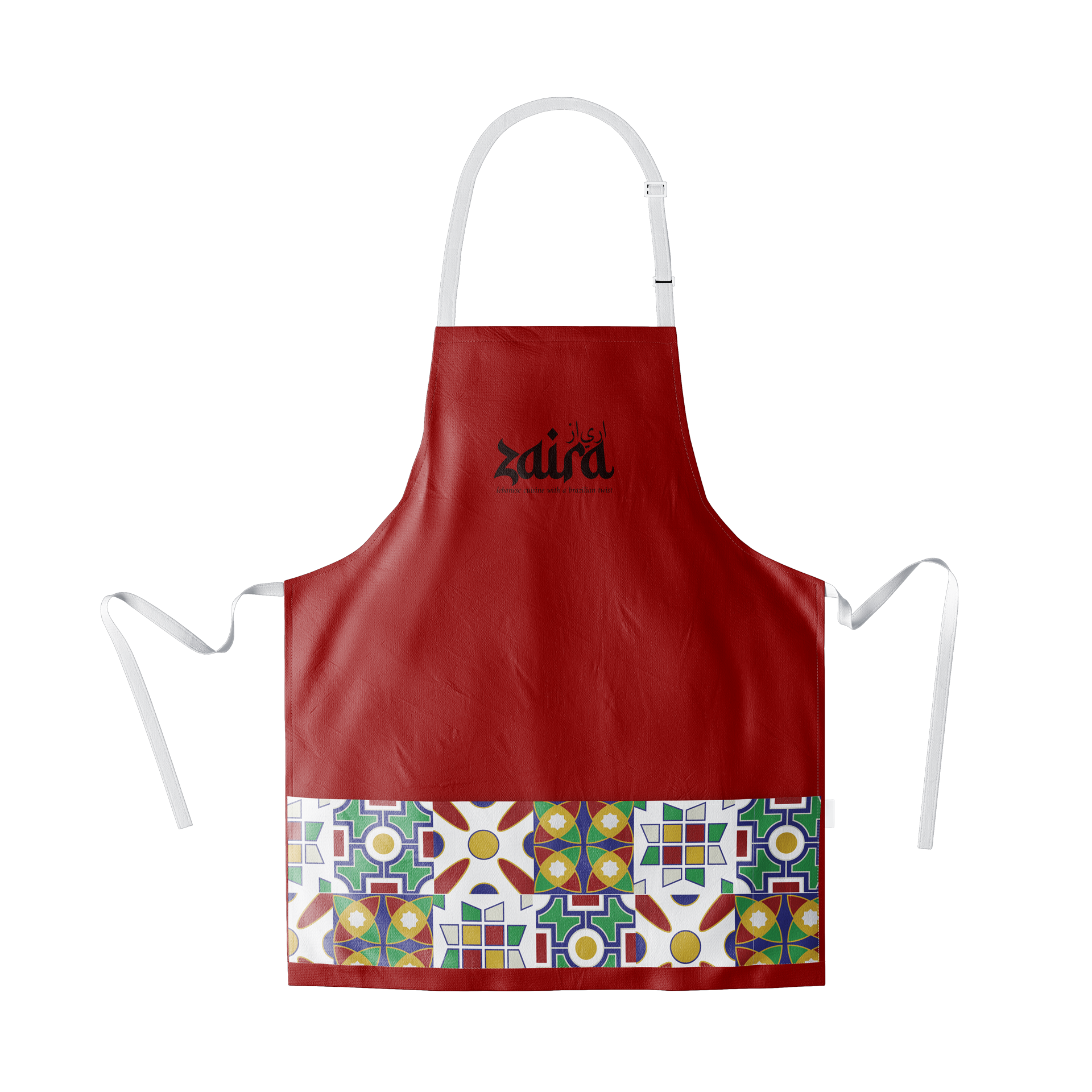
Zaira's colors were chosen to convey identity and sensations that enrich the brand experience. Warm tones, such as garnet red and gold, express sophistication and tradition, while forest green and golden yellow bring freshness and vibrancy. Light beige balances the composition, and navy blue adds depth and contrast. This combination ensures a striking and harmonious aesthetic, reinforcing the brand's visual presence in different applications.
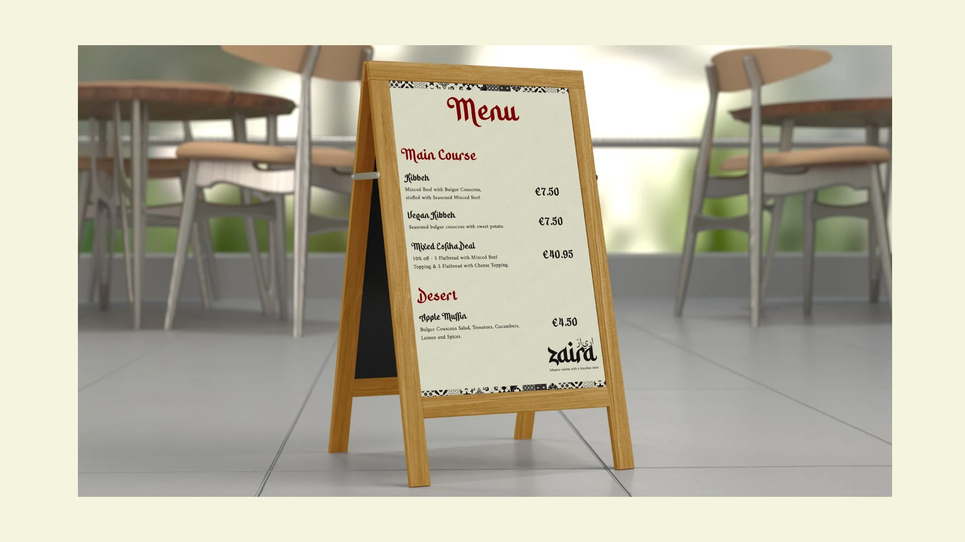
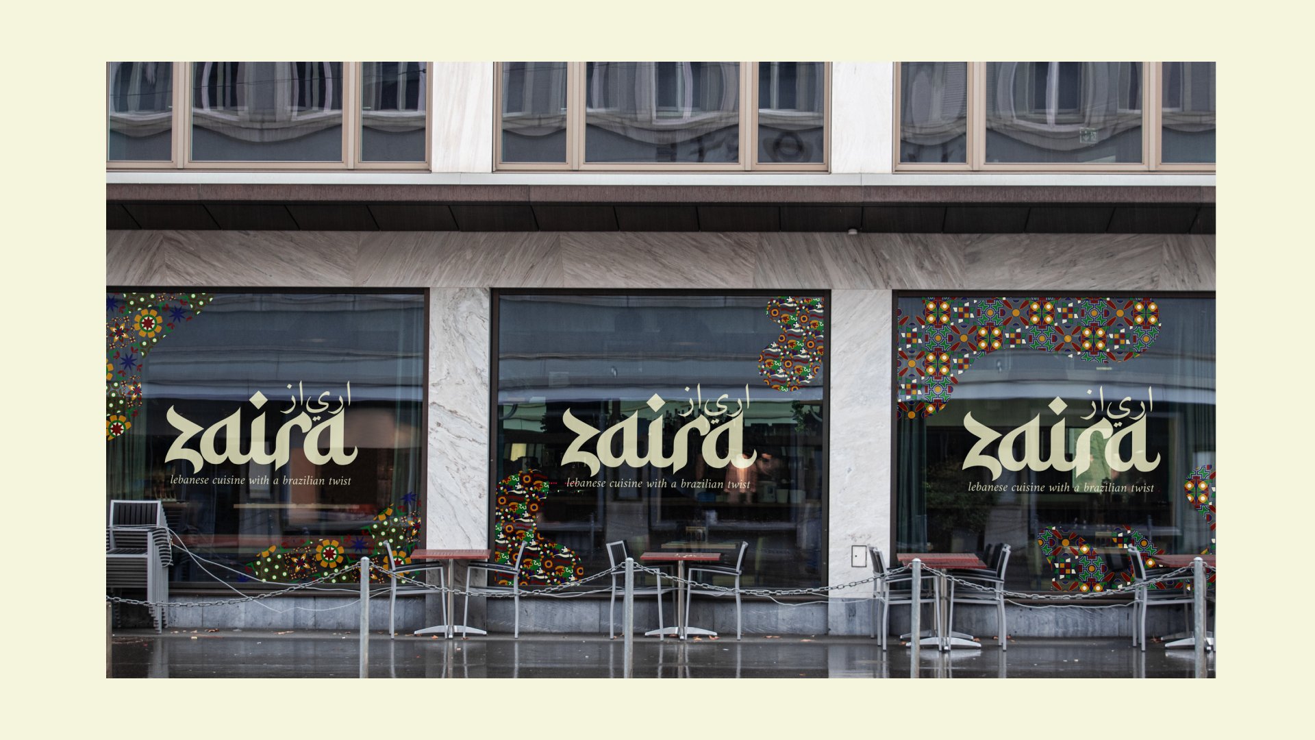
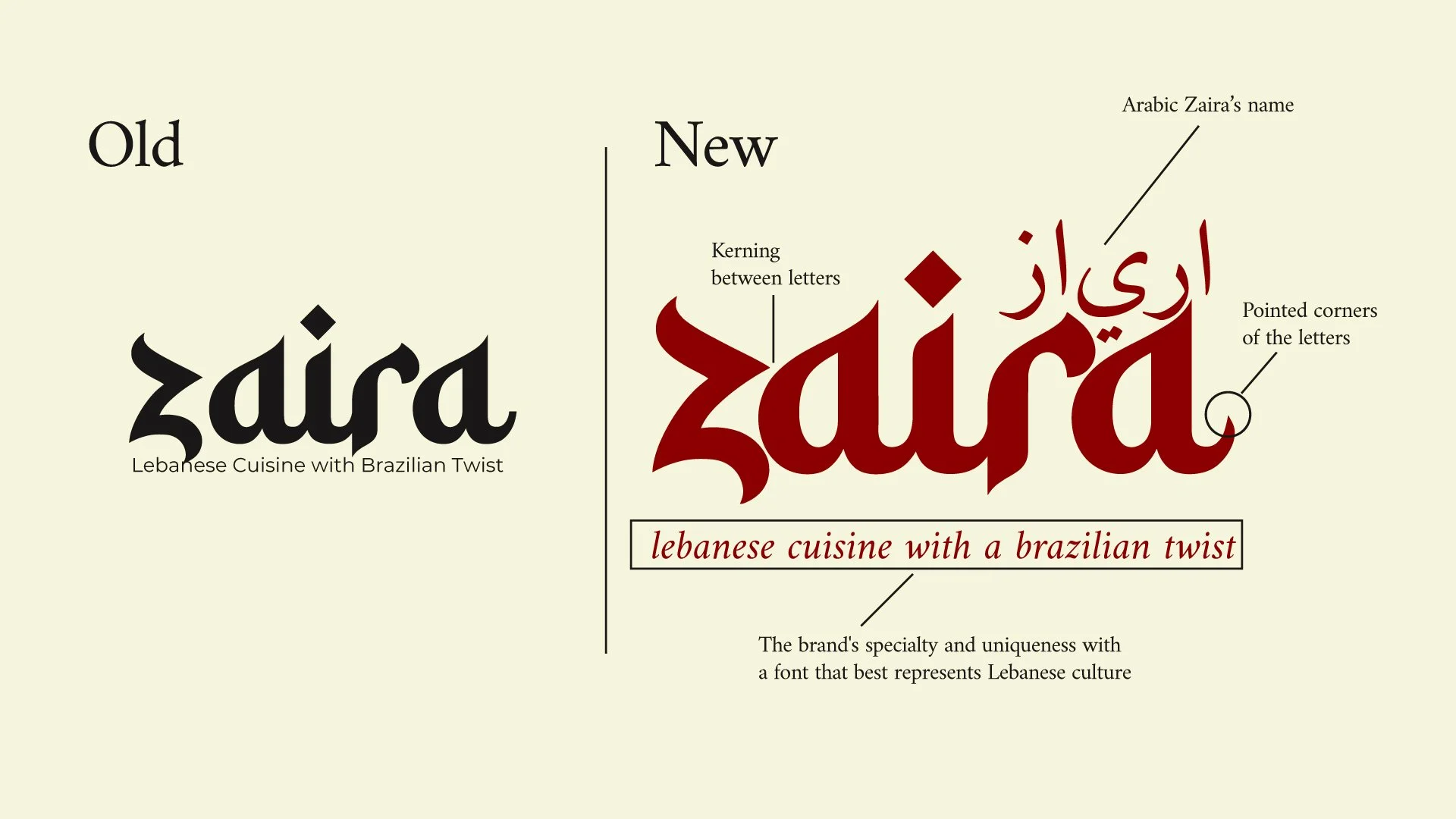
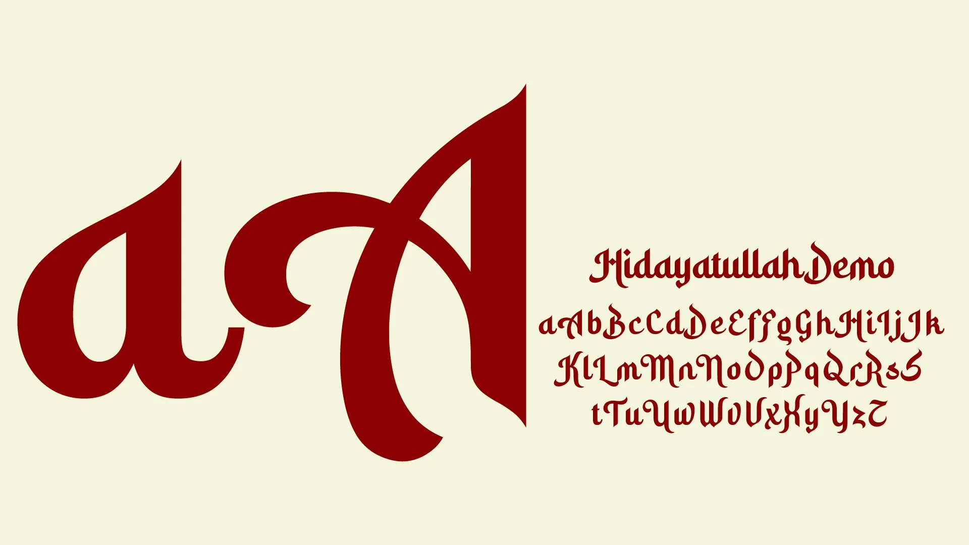
Hidayatullah is present in the logo and we will use it in titles and short words, it is imposing and needs to be used to attract the attention of the end customer.
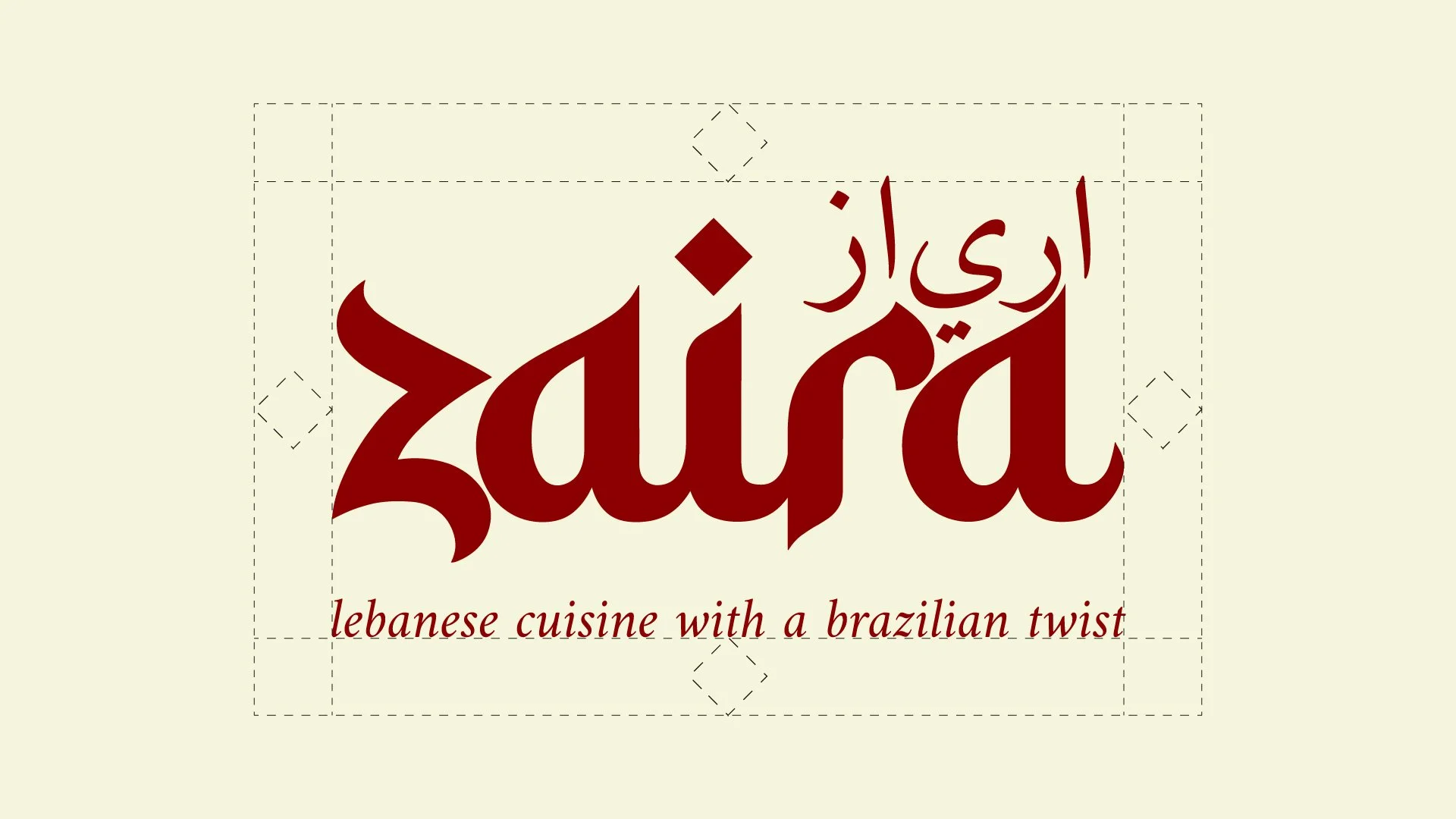
This space serves as protection for the logo; it cannot be interfered with by any image, graphic, or text.
For convenience, I used the dot of the letter i to define this space. So, regardless of the layout, simply use this symbol as a gauge.
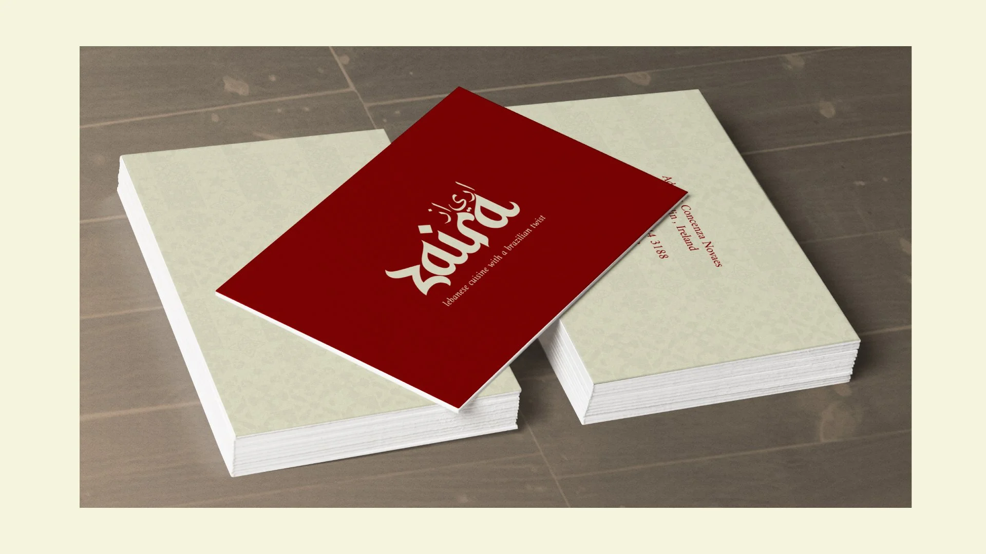
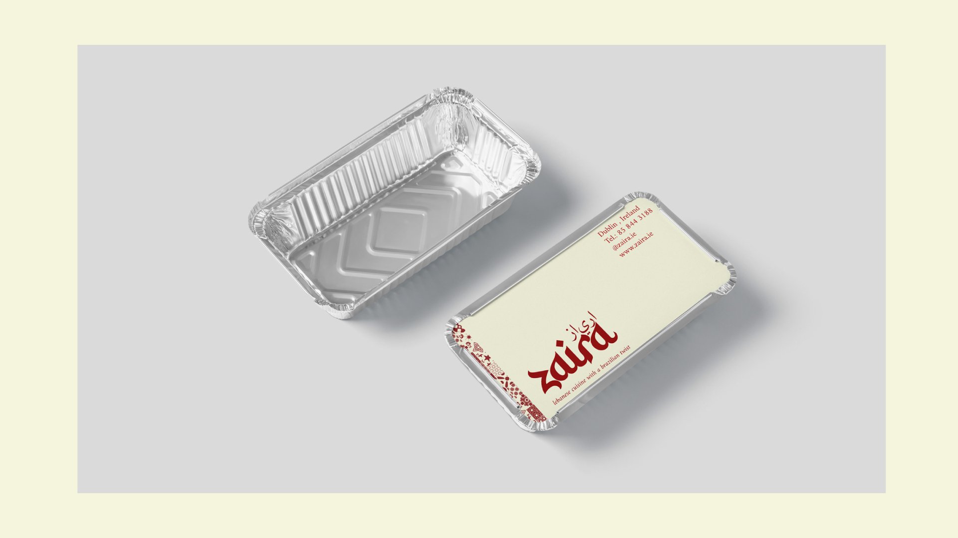
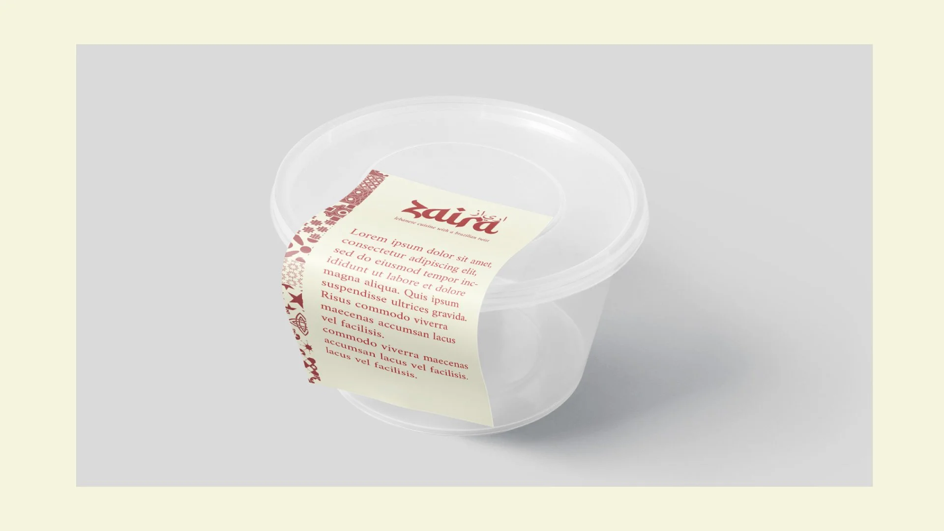
Garnet Red
Meaning: Garnet red reflects the passion and warmth of Lebanese cuisine, as well as its cultural richness. It's a warm colour that also evokes ingredients like pomegranates and spices, and evokes the human warmth present in both cultures.
Why use it: It maintains a strong connection with Lebanon, ensuring that the brand's original identity is preserved.
Pantone®: 7499 C
HEX: #f5f5dc
C: 4 - M: 1 - Y: 15 - K: 0
R: 245 - G: 245 - B: 220
Black Chocolate
Meaning: Sophistication, elegance, and mystery, black serves to create balance. It can be combined with all the colors in the color palette.
Forest Green
Meaning:Green symbolizes freshness, vitality, and the richness of natural ingredients. It represents Brazilian tropical vegetation and the connection with the environment, as well as recalling the vine leaves used in Lebanese cuisine.
Why use it: This shade connects the two countries through nature, reflecting the fusion between Lebanon's freshness and Brazil's exuberance.
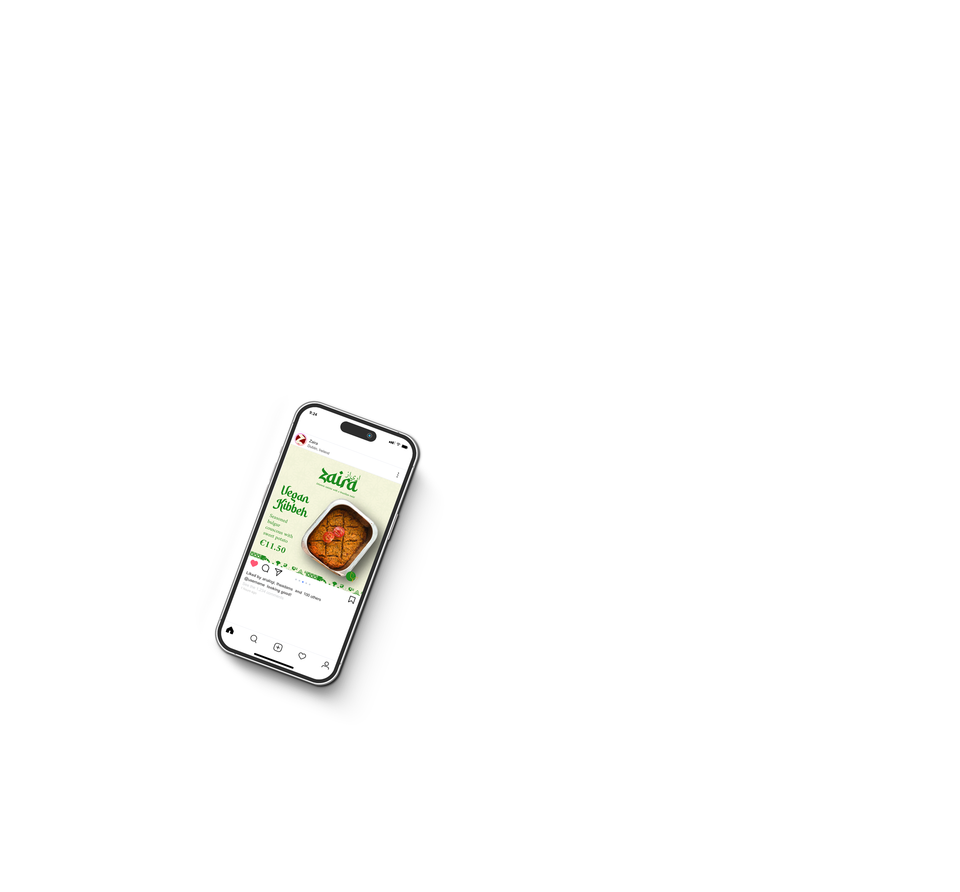
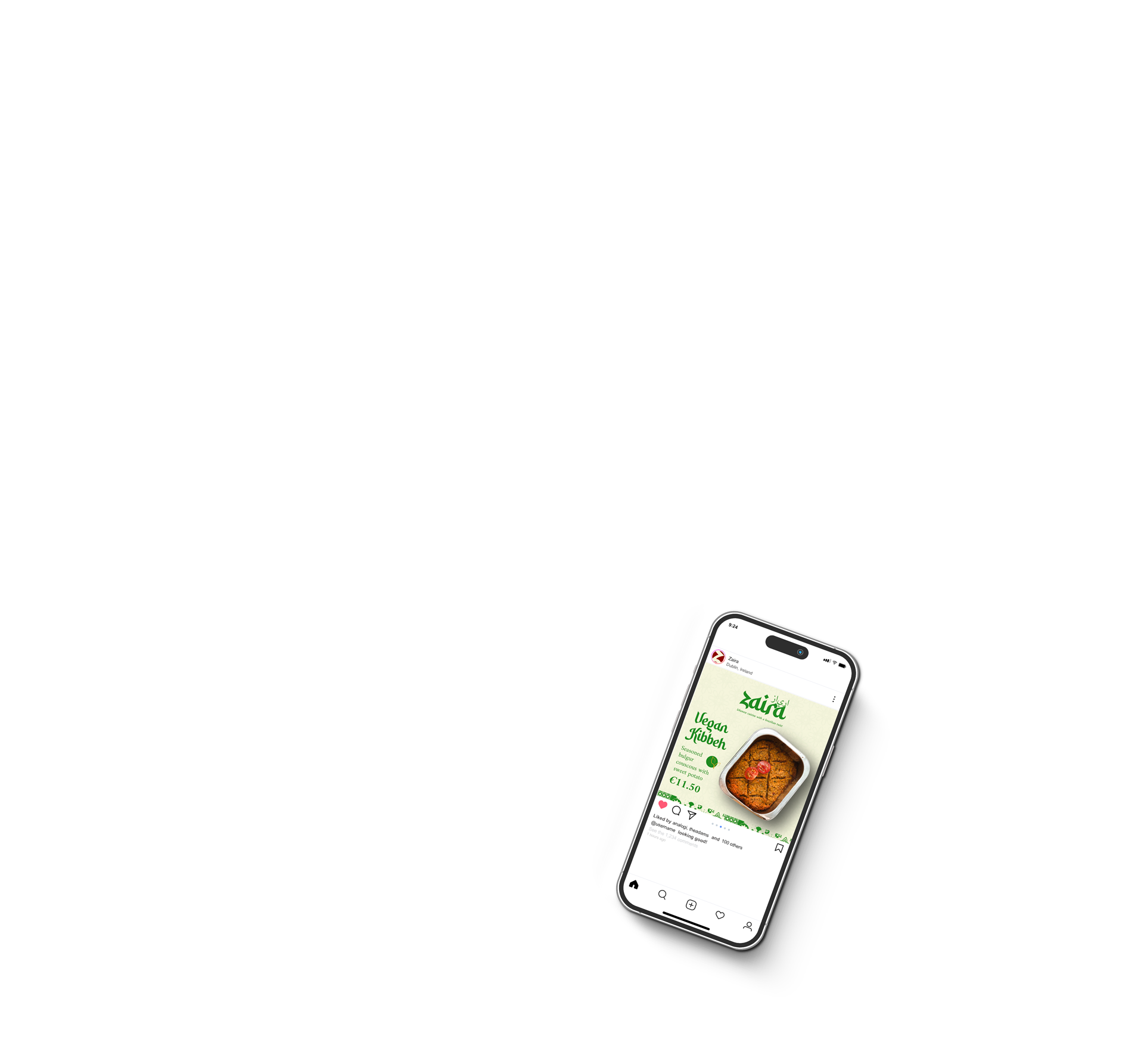
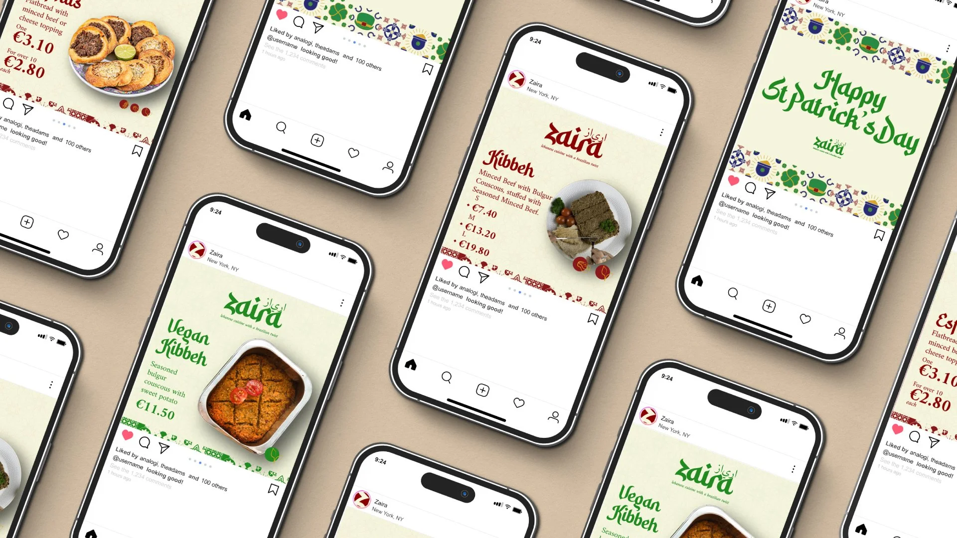
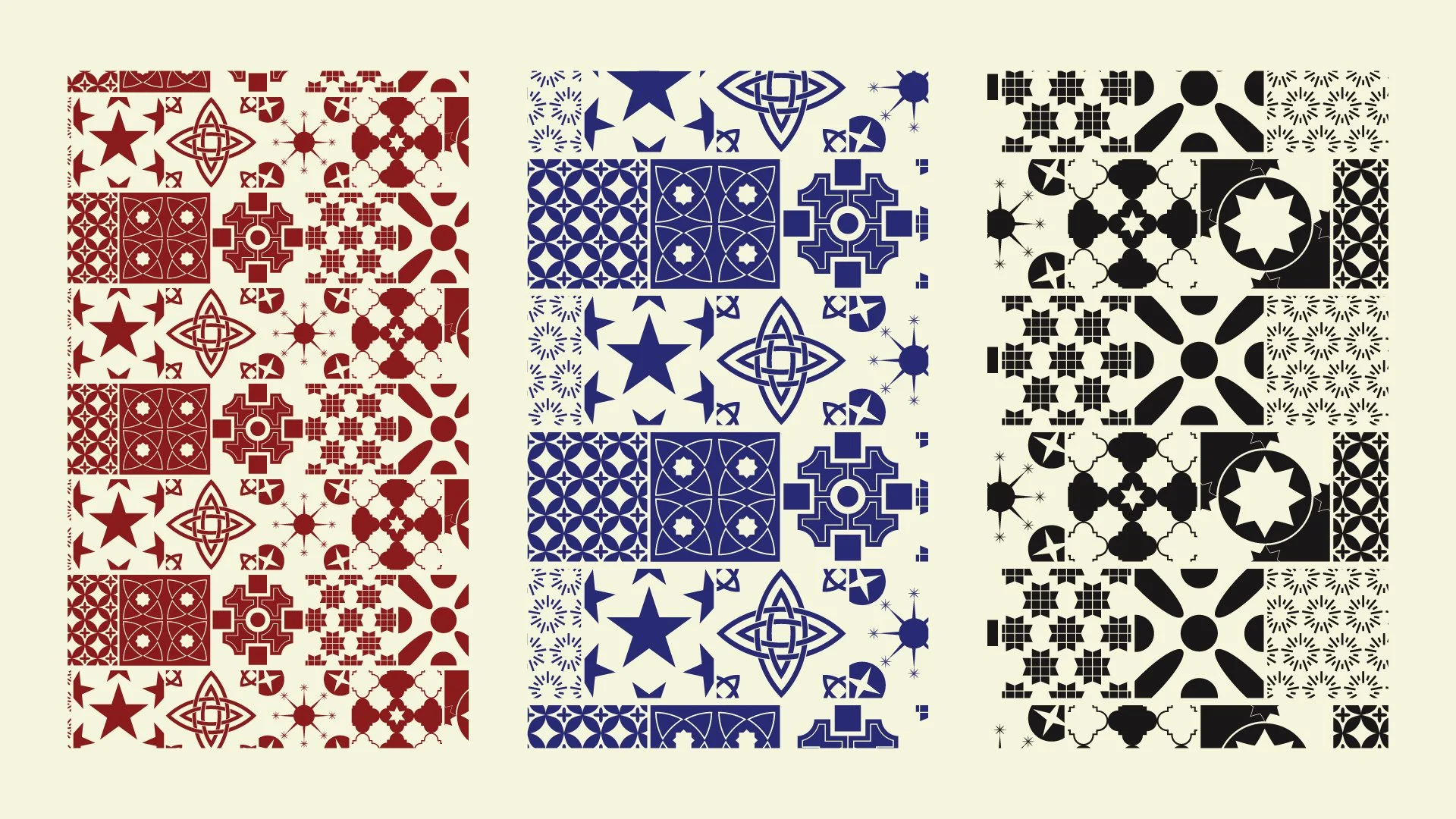
The icons we'll use are primarily for allergy sufferers and social media. They can be used with either a solid base or the brand's main colors.
Colours
Pantone®: 7622 C
HEX: #8b0000
C: 27 - M: 100 - Y: 100 - K: 32
R: 139 - G: 0 - B: 0
Light Beige
Meaning: A neutral tone reminiscent of the sand of the Lebanese deserts and the light tones of dishes like hummus and pita bread. It also evokes simplicity and elegance.
Why use it: It's a perfect base for balancing vibrant colors and bringing harmony to the design, ensuring the layout doesn't feel overwhelming.
Pantone®: Black 6 C
HEX: #191717
C: 72 - M: 67 - Y: 68 - K: 79
R: 25 - G: 23 - B: 23
Pantone®: 6005 C
HEX: #daa520
C: 15 - M: 35 - Y: 100 - K: 0
R: 218 - G: 165 - B: 32
On social media, we'll use this logo with the letter Z from the name Zaira. The intention here is to make the brand unmistakable and minimalist.
Yellow Gold
Meaning: Golden yellow evokes energy, warmth, and joy, characteristics associated with Brazil. It is also a shade that refers to luxury and sophistication, traditional values in Lebanese culture.
Why use it: This colour brings a vibrant glow to the design, representing the Brazilian sun and the golden colour of Lebanese spices, creating a link between tradition and modernity.
Pantone®: 2273 C
HEX: #33541b
C: 76 - M: 42 - Y: 100 - K: 40
R: 51 - G: 84 - B: 27
Pantone®: 2738 C
HEX: #000080
C: 100 - M: 98 - Y: 14 - K: 17
R: 0 - G: 0 - B: 128
Typography
Navy Blue
Meaning: Represents the depth and calm of the Mediterranean Sea that bathes Lebanon, as well as the Atlantic Ocean that connects Brazil to the rest of the world. It also symbolises confidence and sophistication.
Why use it: This tone adds contrast to the design and creates a sense of global connection, reinforcing the concept of cultural fusion.
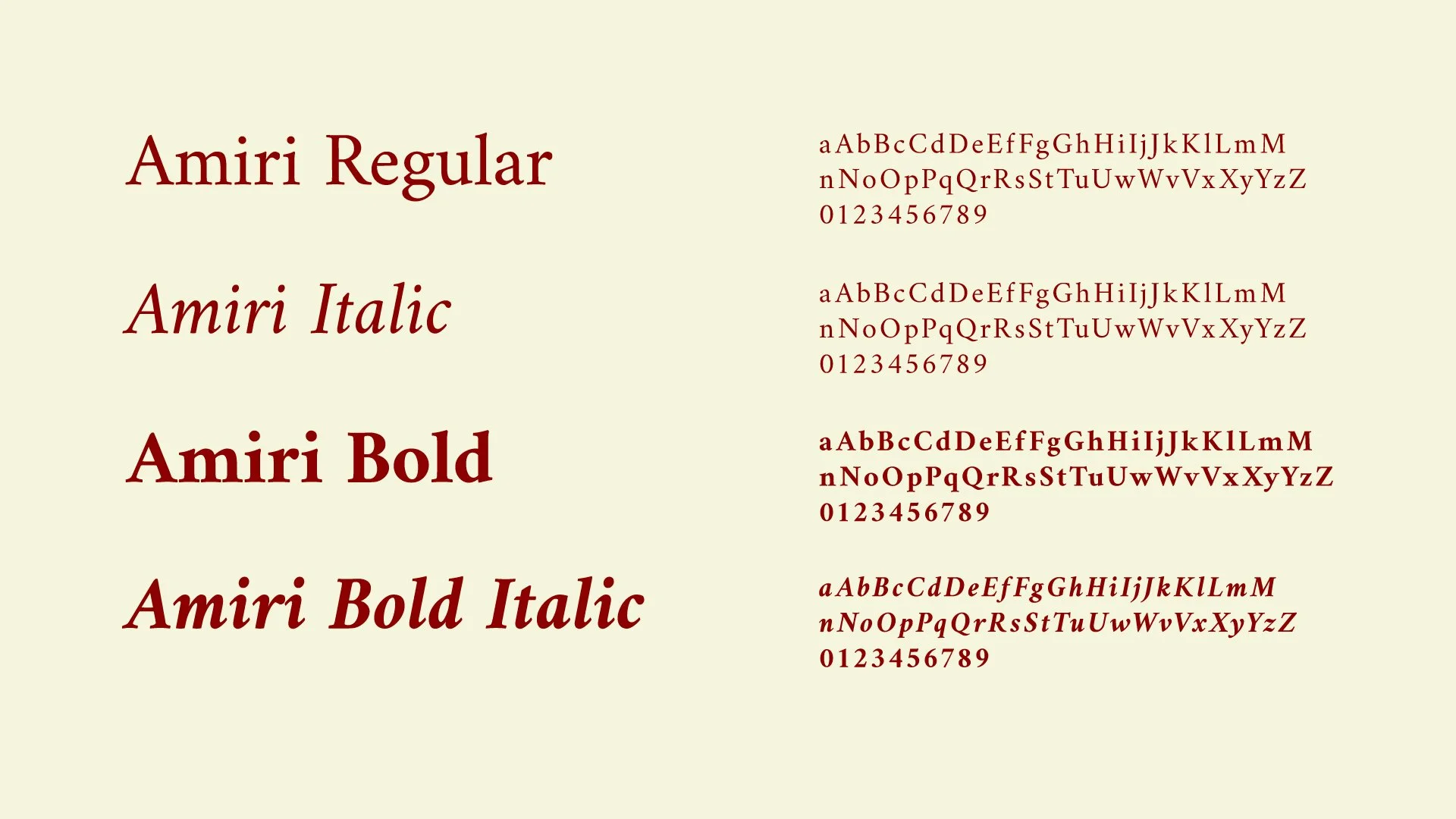
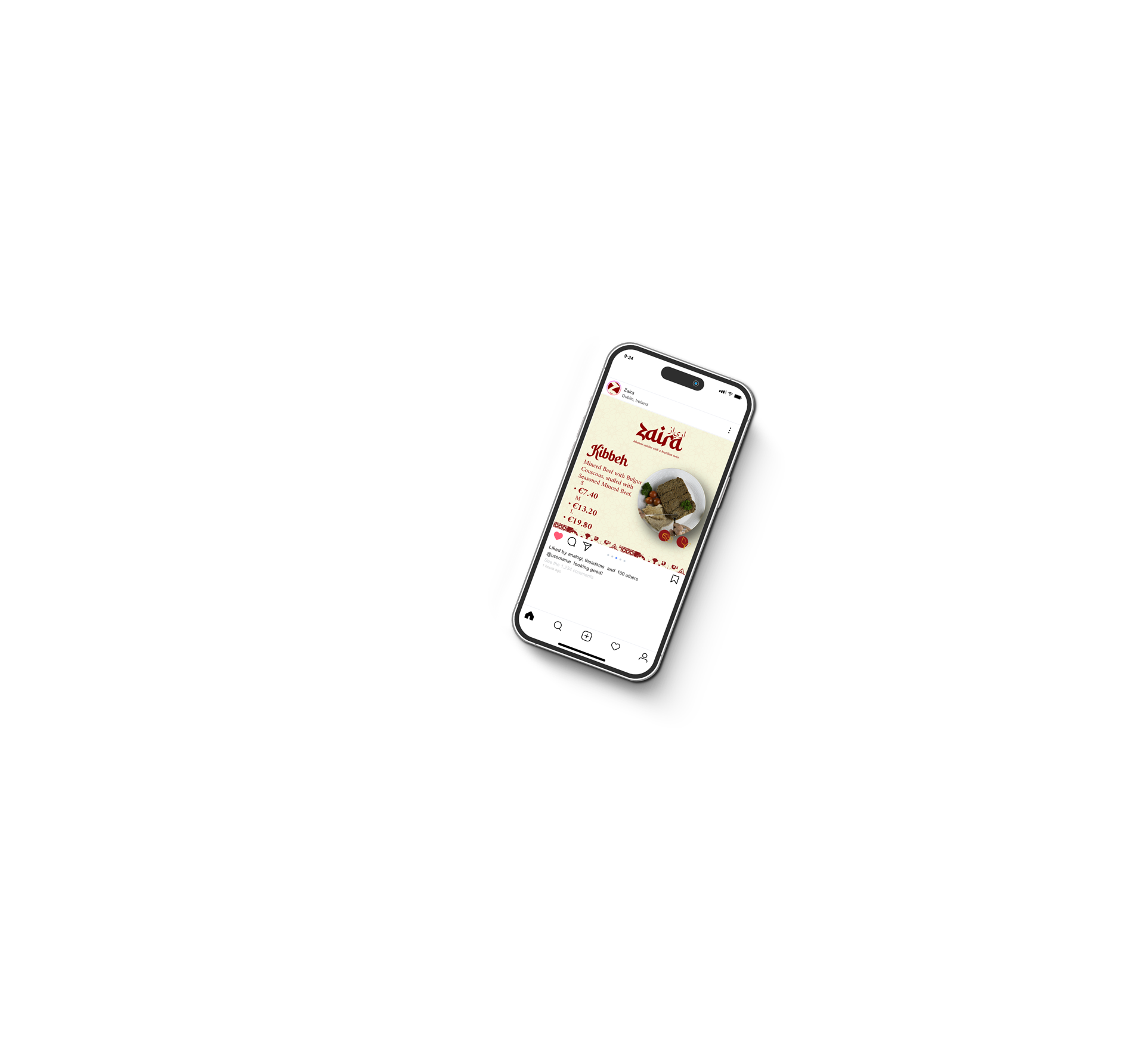
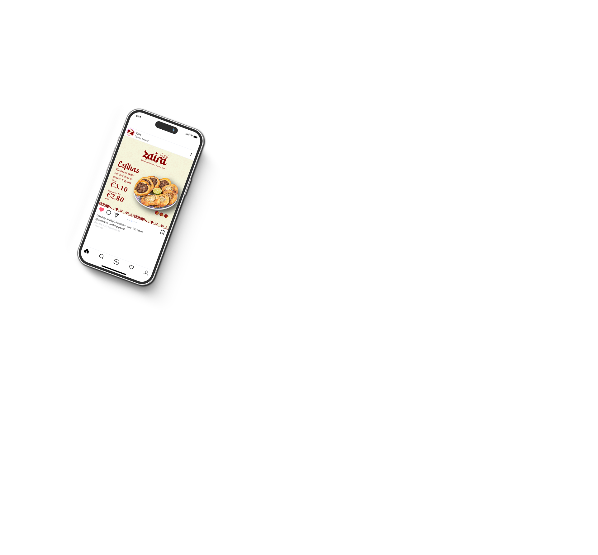
The Amiri font, on the other hand, is easy and quick to read. It works well for online texts and offline materials. It's easy to read and not tiring. This is important so the reader doesn't lose interest in the materials they come across: flyers, menus, banners, posts, etc.